Fix Messy Layouts: Master Spacing with a Calligraphy Generator Free
Contents
- What Are Calligraphy Font Spacing Issues—and Why They Matter
- Why Beginners Struggle with Calligraphy Font Spacing Issues
- Mastering Calligraphy Online: Why Scripts Don’t Follow Standard Rules
- Common Mistakes When Arranging Calligraphy Letters
- How a Calligraphy Generator Free Tool Fixes Spacing Automatically
- Calligraphy Online vs. Manual Adjustment: The Efficiency Battle
- Why Starting with a Calligraphy Generator Free Tool is a No-Brainer
- Final Thoughts: Great Calligraphy is About Spacing, Not Talent
What Are Calligraphy Font Spacing Issues—and Why They Matter
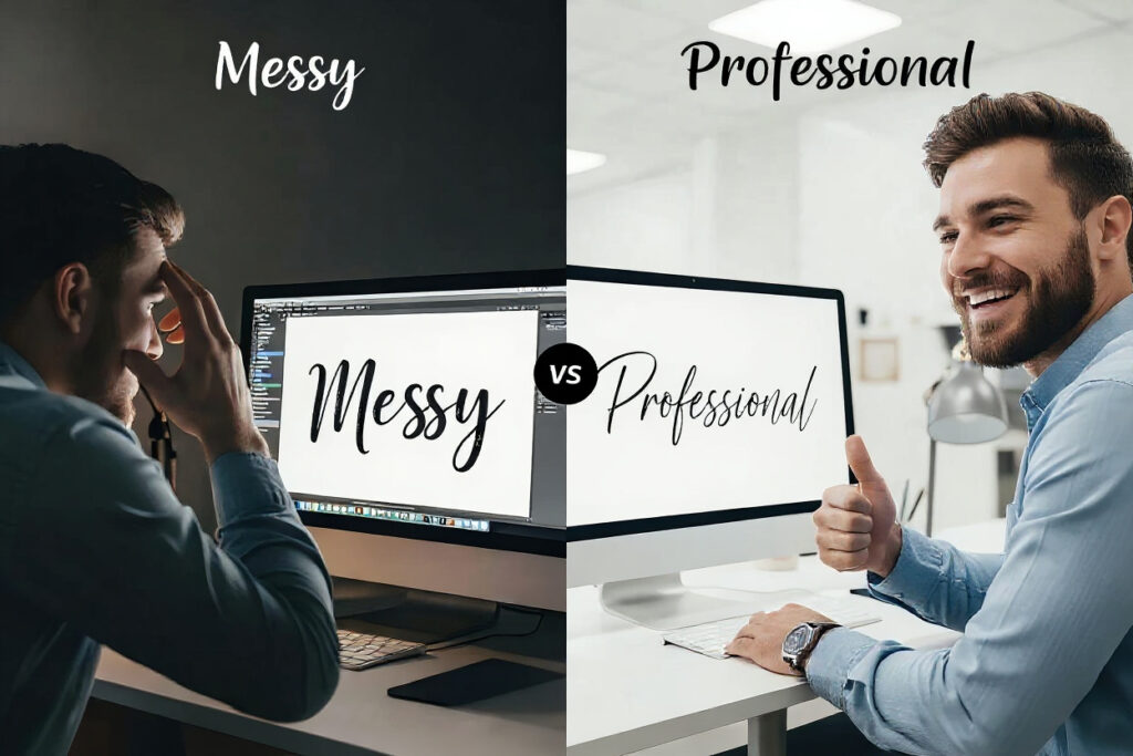
Let’s be honest: calligraphy font spacing issues are the "spinach between the teeth" of the design world. You’ve picked a stunning, swirly set of calligraphy letters for your new brand, but when you type them out, the result looks less like a "Luxury Candle" and more like a ransom note. This happens because high-end lettering isn't just a collection of characters; it’s a delicate dance of ink and negative space. For freelancers and small business owners, bad spacing isn't just a minor hiccup—it’s a trust killer. If you can't be bothered to fix the gap between your 'L' and 'u', why should a customer trust you with their credit card?
This is precisely where a calligraphy generator free tool becomes your secret weapon. Most people assume that great design requires expensive software or a decade of hand-lettering practice. However, when you explore calligraphy online, you realize that the most successful creators aren't nudging pixels manually for hours; they are using smart automation. A calligraphy generator free version allows you to bypass the technical frustration of kerning while ensuring your brand looks premium, polished, and—most importantly—legible.
Professional branding thrives on flow. When you use a high-quality calligraphy generator free resource, you’re essentially hiring a digital master-penman. Standard fonts are like people standing in a crowded elevator—they stay in their rigid rectangular boxes. But calligraphy letters are more like ballroom dancers; they need space for their sweeping arms and long tails. If you don't use a calligraphy generator free platform to manage these movements, your letters will inevitably collide, creating a visual mess that screams "amateur hour."
Why Beginners Struggle with Calligraphy Font Spacing Issues
The Illusion of Even Spacing vs. Script Personality
Most beginners fail at calligraphy font spacing issues not because they lack an eye for beauty, but because they treat script styles like they’re typing a grocery list in Helvetica. In standard typography, you can often get away with "even" spacing. Try that with calligraphy online, and you’ll end up with a visual nightmare. These styles are full of personality—loops, swashes, and descenders that don't respect the invisible boundaries of a normal letter. Without a calligraphy generator free tool, you’re essentially trying to solve a 3D puzzle in a 2D world.
The Science of Optical Volume and Balance
The real headache comes from "Optical Volume." It’s not about the distance between the tips of the calligraphy letters; it’s about the "bucket" of air between them. A slanted stroke often makes the spacing look wider at the top than the bottom. If you don't use a calligraphy generator free tool to mathematically balance these volumes, your wordmark will look like it's leaning or falling over. Beginners often get frustrated because their eyes tell them something is wrong, but their manual tools don't provide the fix.
The Cost of Manual Kerning for Entrepreneurs
Then there’s the time factor. Manual kerning is the design equivalent of watching paint dry. A calligraphy generator free tool uses smart algorithms to do the heavy lifting for you. It knows exactly how a cursive 'r' should tuck into an 'a'. For a startup founder wearing twenty different hats, spending your afternoon nudging pixels is a bad investment. Choosing to work with calligraphy online via a dedicated calligraphy generator free platform gives you back your time while delivering a result that looks like you spent a week on it.
Mastering Calligraphy Online: Why Scripts Don’t Follow Standard Rules
Standard fonts live in cages; professional calligraphy letters live in the wild. In a typical sans-serif font, every character occupies a predictable block. However, when you start working with calligraphy online, you quickly realize that some flourishes travel three letters over, while others have tails that dive into the next line of text. This "territory hopping" is exactly what creates calligraphy font spacing issues. A high-quality calligraphy generator free app recognizes these outliers and adjusts the surrounding "neighborhood" of letters to compensate.
If you’re playing around with calligraphy online for the first time, you might notice that an 'f' sometimes stabs an 'i' in the eye, or a 'y' descender crashes into a 'b' from the line below. This is a classic symptom of ignoring the unique geometry of script styles. A calligraphy generator free tool uses "contextual alternates" and "ligatures" to prevent these collisions. By using a calligraphy generator free site, you ensure that the delicate balance of your calligraphy letters remains intact, no matter how complex the word.
Furthermore, calligraphy online requires an understanding of "visual weight." Some characters are naturally heavier than others. An 'O' takes up more visual space than an 'I', but in calligraphy, the swashes can flip that logic on its head. A calligraphy generator free engine calculates the density of the ink and balances the negative space around it. This is why a logo generated by a calligraphy generator free tool looks "right" instantly, whereas a manual attempt often feels lopsided or "off."
Common Mistakes When Arranging Calligraphy Letters
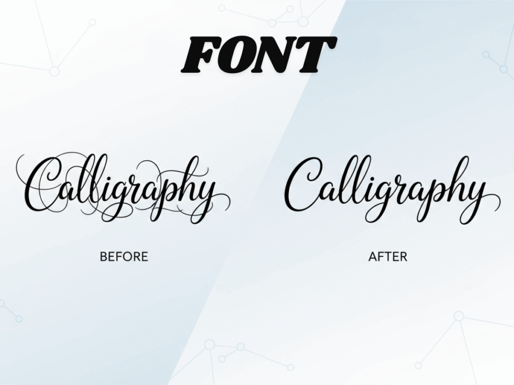
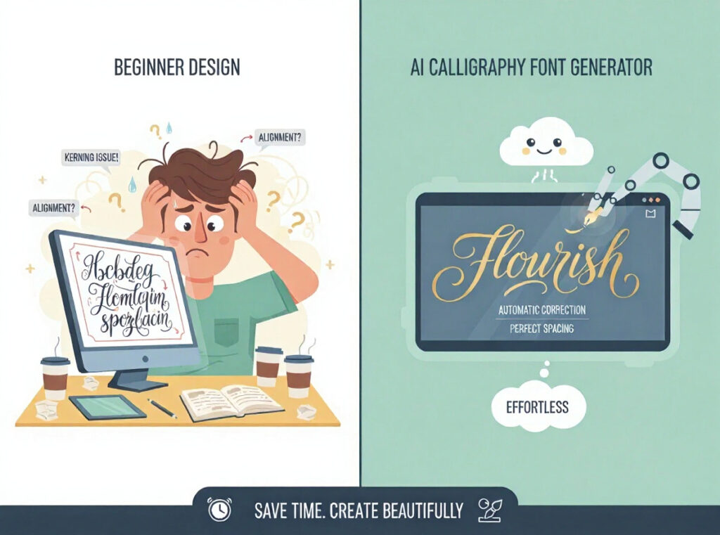
We’ve all been there: staring at a screen until the letters start to blur. One of the most classic blunders when people try to avoid calligraphy font spacing issues is "The Equality Trap"—trying to make the gap between every character exactly the same width. In the world of calligraphy online, equality is actually the enemy of balance. Because calligraphy letters have different shapes (some are round, some are flat), they need different amounts of breathing room. A calligraphy generator free tool handles this paradox perfectly, giving more space where it’s needed and less where it isn't.
Another "pro" mistake is over-tightening the characters to make them look "minimalist." This often leads to severe calligraphy font spacing issues when the design is scaled down for Instagram profile pictures or tiny website footers. If the strokes touch in the wrong places, your beautiful calligraphy letters become an unreadable black blob. A calligraphy generator free tool helps you find that "Goldilocks zone"—not too loose, not too tight. Using a calligraphy generator free platform allows you to zoom out and check if your brand is still readable from across the room.
Finally, ignore the slant at your own peril. Many beginners try to space slanted calligraphy online styles horizontally, forgetting that the letters are actually angled. This results in "The Staircase Effect," where the word looks like it’s tripping over itself. A calligraphy generator free algorithm calculates spacing along the axis of the slant, ensuring that the visual rhythm stays consistent. Don't let your brand look like it’s had one too many cocktails; use a calligraphy generator free tool to keep it standing tall and elegant.
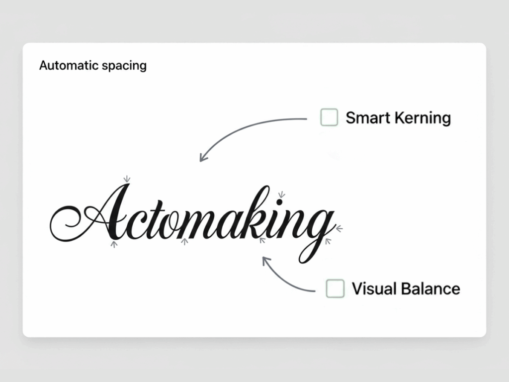
How a Calligraphy Generator Free Tool Fixes Spacing Automatically
Think of a modern calligraphy generator free tool as a tiny, very obsessed Swiss watchmaker living inside your computer. It doesn't just "put space" between your calligraphy letters; it analyzes the geometry of every curve. When you type your name into a high-quality calligraphy online engine, it looks at the exit stroke of the first letter and the entry stroke of the second, then fuses them into a seamless flow. This is the difference between a word that looks "typed" and a word that looks "crafted."
The automation within a calligraphy generator free tool also handles the nightmare of "overlapping swashes." When you have an 'f' followed by a 'j', the two long tails can create a tangled mess that leads to massive calligraphy font spacing issues. A calligraphy generator free platform knows how to shift these letters or swap them for ligatures to maintain clarity. Even if you’re just using a calligraphy generator free version, this level of algorithmic intelligence saves you from dozens of manual corrections that usually still look "off" anyway.
Beyond just technical fixing, a calligraphy generator free app ensures "visual weight" consistency. If one side of your word looks heavy and the other looks thin, the whole design feels lopsided. By accessing calligraphy online, you are utilizing tools that calculate the density of the ink and balance the surrounding negative space. This is crucial for signatures and brand marks where first impressions are everything. Why struggle with manual tweaks when a calligraphy generator free tool can do the math in milliseconds?
Calligraphy Online vs. Manual Adjustment: The Efficiency Battle
| Feature | Manual Adjustment | Calligraphy Generator Free |
|---|---|---|
| Effort | Soul-crushing pixel nudging | One-click magic |
| Logic | "I think this looks okay?" | Mathematical perfection |
| Speed | Slow as a snail | Faster than your morning coffee |
| Accessibility | Requires expensive design apps | Instant via calligraphy online |
| Results | Hit or miss | Consistently premium |
For a freelancer managing multiple clients, you don't have the luxury of time to fix every single one of the calligraphy font spacing issues you encounter. A calligraphy generator free tool isn't just a toy; it's a productivity hack. It allows you to produce professional-grade calligraphy letters in minutes. By moving your workflow to calligraphy online, you ensure that your output remains consistent across all branding materials without burning out on minor details.
Why Starting with a Calligraphy Generator Free Tool is a No-Brainer
If you’re on the fence, starting with a calligraphy generator free platform is a zero-risk way to upgrade your design game. Most calligraphy online tools offer a wide variety of styles, from modern brush scripts to traditional copperplate. This allows you to experiment with how different calligraphy letters interact without committing to a purchase. You can see instantly if your brand name creates specific calligraphy font spacing issues that need addressing.
A calligraphy generator free version often comes with high-quality presets that are already optimized for the web. You can play with different letter combinations to see which specific calligraphy letters look best for your logo. It’s a learning experience without the steep price tag. By the time you’re ready to finalize your design, you’ll know exactly how calligraphy online can elevate your look from "DIY" to "D-Wow." Using a calligraphy generator free tool is simply the smartest way to start.
Final Thoughts: Great Calligraphy is About Spacing, Not Talent
At the end of the day, a beautiful calligraphy letters design is only as good as its spacing. You can have the most expensive, handcrafted font in the world, but if you don't solve the calligraphy font spacing issues, it will look amateur. The rise of calligraphy online has leveled the playing field for creators everywhere. You no longer need years of training to avoid common mistakes; you just need a reliable calligraphy generator free tool.
By choosing to use a calligraphy generator free platform, you are choosing consistency, professionalism, and speed. Whether you are creating a personal signature or a global brand mark, remember that spacing is the secret ingredient. Don't let poor kerning ruin your hard work. Entrust the technical precision of your calligraphy letters to a smart, free calligraphy generator engine in Refont, and dedicate your energy to scaling your creative empire.