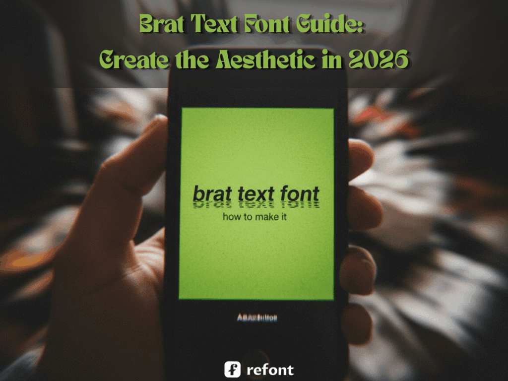
Brat Text Font Guide: Create the Aesthetic in 2026
Contents
- What Is the Brat Aesthetic — And Why Does It Still Hit in 2026?
- What Makes a Brat Text Font Actually Authentic?
- Refont Brat Font Generator: Features & Competitive Edge
- How to Create Brat-Aesthetic Visuals with Refont
- Real-World Use Cases for Brat Text Font
- How Brat Font Generator Is Reshaping Visual Marketing
- Frequently Asked Questions About Brat Text Font
- Start Generating Your Brat Text Font Today
Imagine it’s the summer of 2024. A blurry, low-resolution lime green square with a slightly squashed Arial font begins to colonize your feed. You don’t know why, but you can’t look away. Fast forward to 2026, and the brat text font hasn't just survived; it has evolved into a definitive visual language for anyone rejecting the hyper-polished, AI-saturated "perfection" of the modern web. Whether you are a social media creator, a rebellious brand designer, or just someone trying to capture a specific "I don’t care" energy, understanding the brat text font is essential. This guide will walk you through what makes the brat text font iconic, why it remains a powerhouse in 2026, and how you can use Refont to generate your own brat aesthetic font masterpieces in seconds. We aren’t just talking about a color; we’re talking about a vibe that refuses to be ignored.
What Is the Brat Aesthetic — And Why Does It Still Hit in 2026?
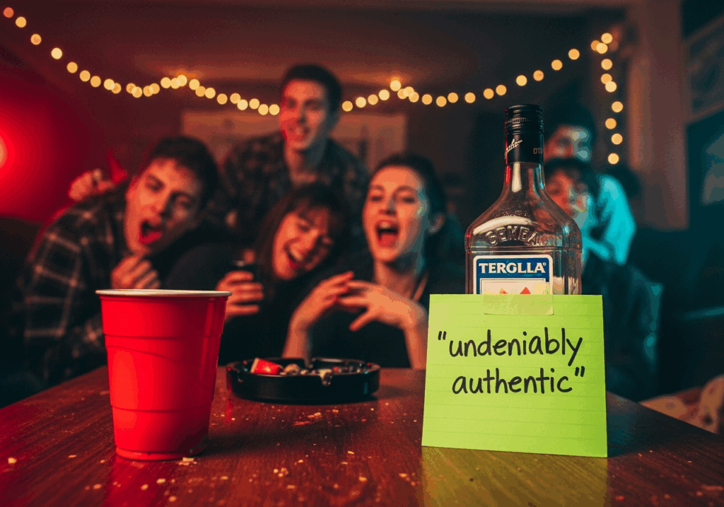
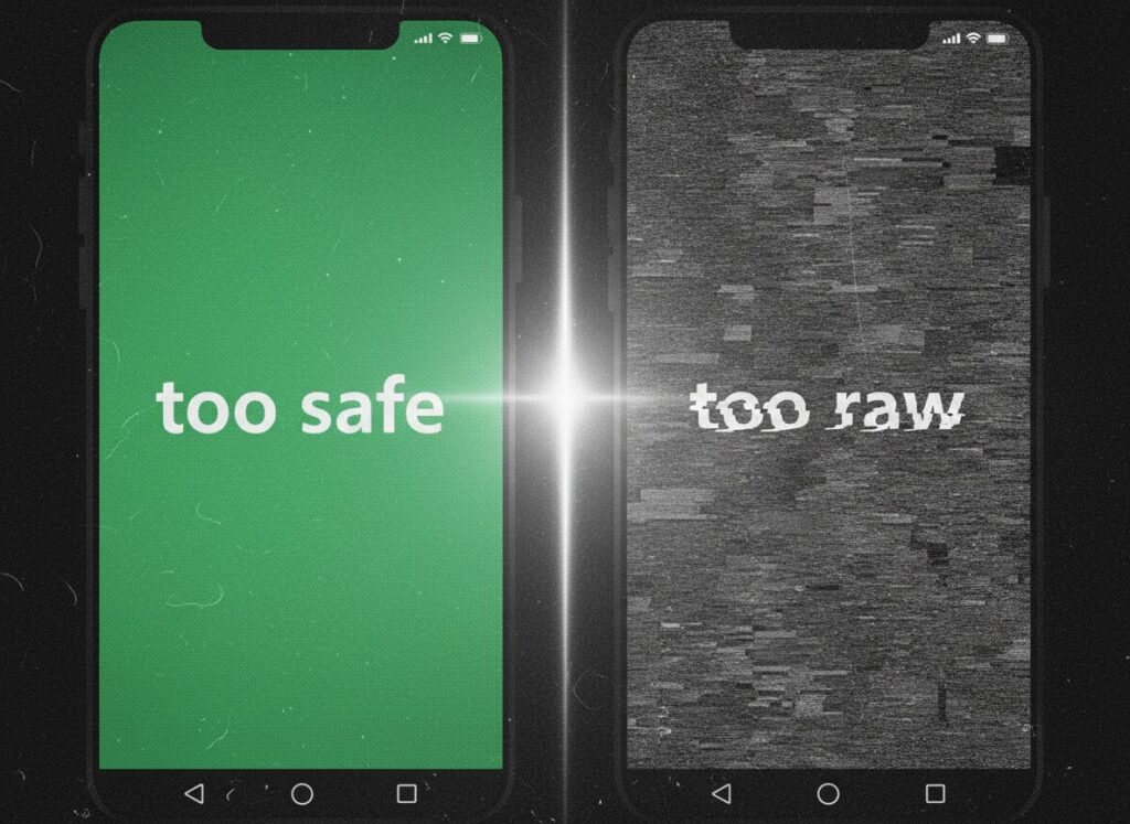
In a world where AI can generate a "perfect" sunset or a "flawless" logo in milliseconds, perfection has become boring. By 2026, the digital audience has developed a massive craving for something that looks human, messy, and real. The brat aesthetic sits at the throne of this anti-perfection movement. It’s the visual equivalent of a blurry photo taken at a 3 AM house party—it feels immediate, unpolished, and undeniably authentic. The brat text font is the heartbeat of this movement.
More Than a Color: The "Anti-Polish" Attitude
Common misconception: "Brat" is just that specific shade of green. Wrong. That’s like saying "Punk" is just a leather jacket. At its core, the brat text font represents a stance: "I don’t need to try to look good because I already know I’m the moment." It’s a deliberate rejection of symmetry, high resolution, and expensive-looking typography. When you look at a brat aesthetic font, you see something that looks like it was made in five minutes on a broken phone, yet it carries more weight than a million-dollar ad campaign. This "anti-polish" attitude is why the brat text font remains the go-to for anyone wanting to signal authenticity over artifice.
Why Lo-Fi Wins When AI Makes Everything Too Perfect
By 2026, we’ve seen enough 8K resolution renders to last a lifetime. In this context, Lo-Fi (low-fidelity) design has gained a "scarcity premium." It suggests a human was behind the screen, making choices that aren't mathematically "correct" but emotionally resonant. The brat text font thrives here. It doesn't use the smooth curves AI loves; it uses jagged edges, pixelation, and aggressive stretching. Learning how to make brat style font is essentially learning how to un-learn the rules of "good" design to find something better: something true. The brat text font is the ultimate antidote to the sterile perfection of modern algorithms.
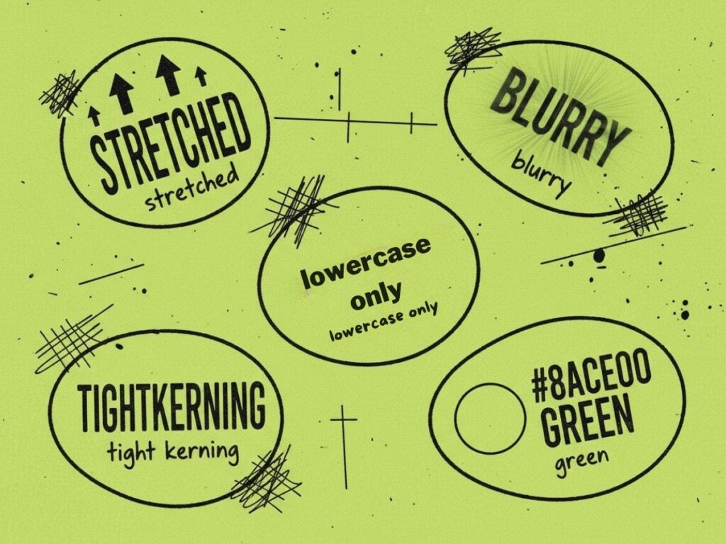
The Core DNA of Brat Text Font
To master the brat text font, you have to understand its genetic makeup. It’s not a random mess; it’s a specific kind of chaos. Here are the five visual pillars of the brat text font:
- Extreme Vertical Stretching: The letters look like they are reaching for the top of the frame, creating a sense of tension.
- Deliberate Blurring: High-def is the enemy. A true brat text font looks like a screenshot of a screenshot.
- All Lowercase: Capitals are too formal. Lowercase is casual, dismissive, and "bratty."
- Tight Kerning: The letters crowd each other, adding to the lo-fi, rushed feel.
- The #8ACE00 Green: While it works on other colors, the iconic lime green is the classic backdrop for the brat text font.
Why Brands Need This Rebellious Energy
Brands in 2026 face a tough crowd: Gen Z and Gen Alpha, who can smell a traditional marketing pitch from miles away. Using a brat text font allows a brand to bypass these defenses. It says, "We aren't a corporate machine; we're part of the culture." Whether it's a streetwear drop or a limited-edition energy drink, incorporating a brat aesthetic font into the branding communicates an immediate sense of relevance. If you want to know how to make brat style font work for business, it’s about using that rebellious energy to create an "insider" feeling that polished ads simply cannot replicate.
What Makes a Brat Text Font Actually Authentic?
Not all stretched, lowercase text is "brat." Just like wearing a flannel shirt doesn't make you Nirvana, simply messing with a font doesn't mean you’ve captured the brat text font spirit. Authenticity in this aesthetic is found in the details—the parts that look like mistakes but are actually highly calculated design choices. Let’s dive into what separates the real brat text font from the imitators.
Intentional Low-Res: The "Looks Rushed" Effect
There is a massive difference between a low-quality file and "intentional low-res." A real brat text font uses blur and pixelation as a texture, not a technical failure. It needs to look like it was created in the heat of the moment—maybe on a bus, maybe in a club. This "looks rushed" effect is actually hard to pull off manually. If the blur is too uniform, it looks like a cheap filter. If it’s too messy, it’s unreadable. The perfect brat aesthetic font hits that sweet spot where it feels vibrantly alive and slightly out of focus.
Visual Distortion: Why Stretched > Balanced
Traditional typography is all about balance, x-height, and baseline grids. The brat text font throws all that out the window. By vertically stretching the characters to 130–150%, you transform the text from something people read to something people confront. This distortion creates a visual pressure that forces the viewer to pay attention. When learning how to make brat style font, the most important lesson is that imbalance is your friend. A balanced font is polite; a brat text font is loud and disruptive.
Emotional Voltage: Conveying Attitude, Not Just Aesthetics
A brat text font doesn't just sit there looking pretty. It has "emotional voltage." It conveys a specific type of confidence—the kind that doesn't care if you like it or not. Before a single word is read, the visual style of the brat aesthetic font has already communicated the mood: late nights, loud music, and zero apologies. If your design feels like it belongs on a corporate "Mission Statement" poster, it isn't a brat text font. The ultimate test: if it looks like it would offend your high school typography teacher, you’re on the right track.
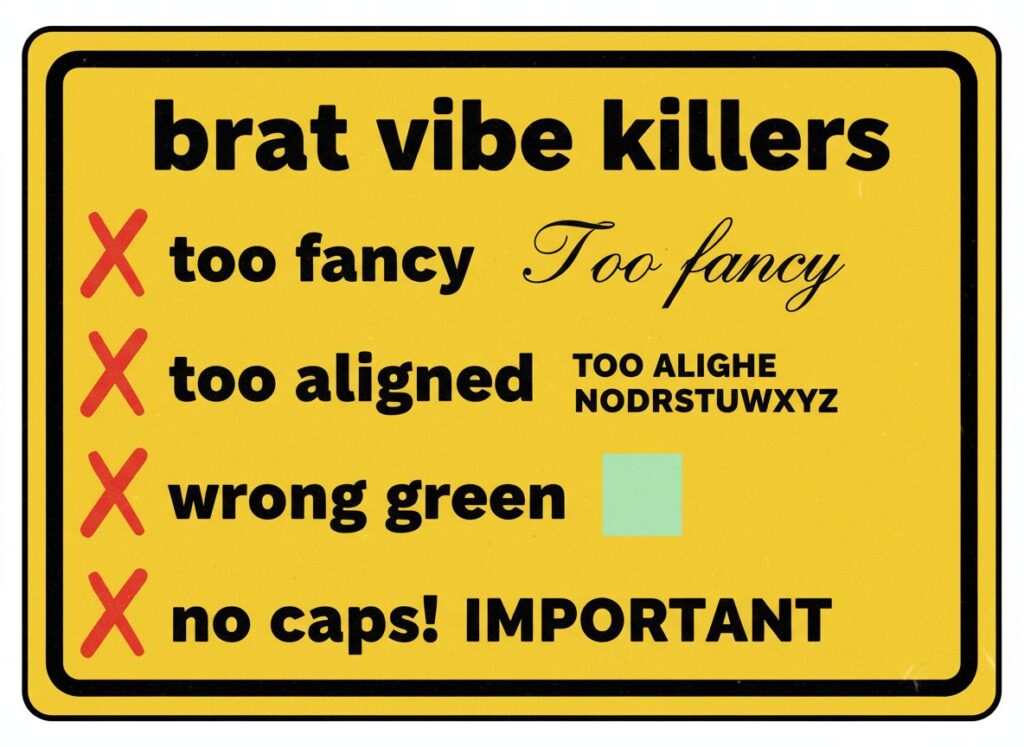
Common Mistakes That Kill the Brat Vibe
Getting the brat text font wrong is easy. Here are the vibe-killers to avoid:
- Being Too Fancy: Using a script or decorative font. A brat text font needs to be blunt, usually a sans-serif like Arial or Helvetica.
- Perfect Alignment: If it looks perfectly centered and measured, it's not "brat."
- The Wrong Green: Using a mint or neon green. You need that specific, slightly sickly lime.
- Capitalization: Using a capital letter at the start of a sentence immediately breaks the spell of the brat aesthetic font.
Avoiding these is why many creators now turn to specialized tools like Refont to ensure they get the brat text font right every time.
Refont Brat Font Generator: Features & Competitive Edge
Knowing the theory of the brat text font is one thing; executing it is another. For years, designers had to manually distort and blur text in Photoshop to get the look. Now, Refont’s brat text font generator simplifies the entire process. It’s designed to bridge the gap between "I want that vibe" and "I have that file."
The Traditional Design Pain Points
In the past, figuring out how to make brat style font was a chore. You had to find a base font, manually adjust the vertical scale, apply Gaussian blurs, add noise, and tweak the hex code for the green. If you needed to change a single word, you had to start over. Most font libraries only give you the raw OTF/TTF file, leaving 90% of the work to you. This is where the quest for a brat text font usually hits a wall for non-designers.
Core Features of Refont's Brat Generator
Refont isn't just a font list; it’s a dedicated engine for the brat aesthetic font. Here is why it’s the gold standard in 2026.
From Search to Instant Generation
Think of Refont as a factory, not a warehouse. Instead of just searching for a brat text font and downloading a file, you input your text and get a finished piece of design. The system handles the stretching, the color, and the blur automatically. You aren't just getting letters; you’re getting a ready-to-post brat text font visual.
Beyond Canva's "Too Clean" Filters
Canva is great for birthday invites, but its filters are often too "safe" and commercial. It struggles to capture the gritty, low-res soul of a true brat text font. Refont’s algorithm was specifically tuned for the 2026 aesthetic. It understands the exact pixel-to-blur ratio needed to make a brat aesthetic font look authentic rather than just "blurry."
High-Fidelity Export, Zero Learning Curve
Despite the "low-res" look, you need high-resolution exports for printing on shirts or posters. Refont allows you to export your brat text font creation in high quality while maintaining that lo-fi texture. Plus, there’s no learning curve. If you can type a text message, you can master how to make brat style font on Refont.
Refont vs. The Competition: A Closer Look
When it comes to Brat Optimization, traditional font sites offer no specific support, and generic design tools like Canva only provide limited, basic filters that often miss the mark. In stark contrast, Refont features a Dedicated Engine specifically tuned to capture every nuance of the brat aesthetic. This specialization directly impacts the Workload involved; while traditional sites require high manual effort and post-processing in Photoshop, and generic tools still demand medium effort to tweak filters, Refont achieves a Zero Workload experience with its seamless, one-click generation.
The difference is also evident in the Output Type and overall results. Traditional font sites only provide raw .ttf files, leaving all the design work to you, and generic tools output a design project that still requires further management. Refont, however, delivers a Ready-to-use Image immediately upon generation. This leads to a significant gap in Aesthetic Accuracy: where traditional and generic tools often result in low to average visual quality, Refont ensures a Perfect recreation of the authentic brat style every time.
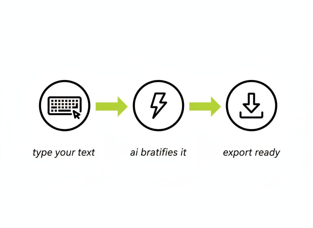
How to Create Brat-Aesthetic Visuals with Refont
Ready to stop talking and start creating? Here is the quickest way to get your brat text font out into the world. No design degree required.
Step 1 — Browse the Brat Font Style Gallery
When you land on Refont, don't look for a "font list." Look for the mood. The gallery shows you finished examples of the brat text font in action. Browse until you find the specific level of "messy" that matches your project. Seeing the brat aesthetic font in a real-world context helps you calibrate your own creative vision before you even start.
Step 2 — Click "Generate Similar Font" to Match the Vibe
Found a look you love? Click "Generate Similar Font." This is the magic part. Instead of you trying to figure out how to make brat style font parameters work, Refont’s AI analyzes the reference image’s stretch, blur, and color density. It sets the stage so you can just focus on the message of your brat text font.
Step 3 — Customize Your Brat Text Font
Now, type in your text. Whether it’s a sarcastic meme or a brand slogan, watch it instantly transform into the brat aesthetic font. You can tweak the intensity—want it more stretched? More blurry? Less green? The real-time preview makes finding the perfect brat text font feel like a game rather than a task. Once you're happy, hit export and you’re done.
Real-World Use Cases for Brat Text Font
By 2026, the brat text font has moved from niche memes to mainstream utility. It’s a tool for communication that cuts through the noise.
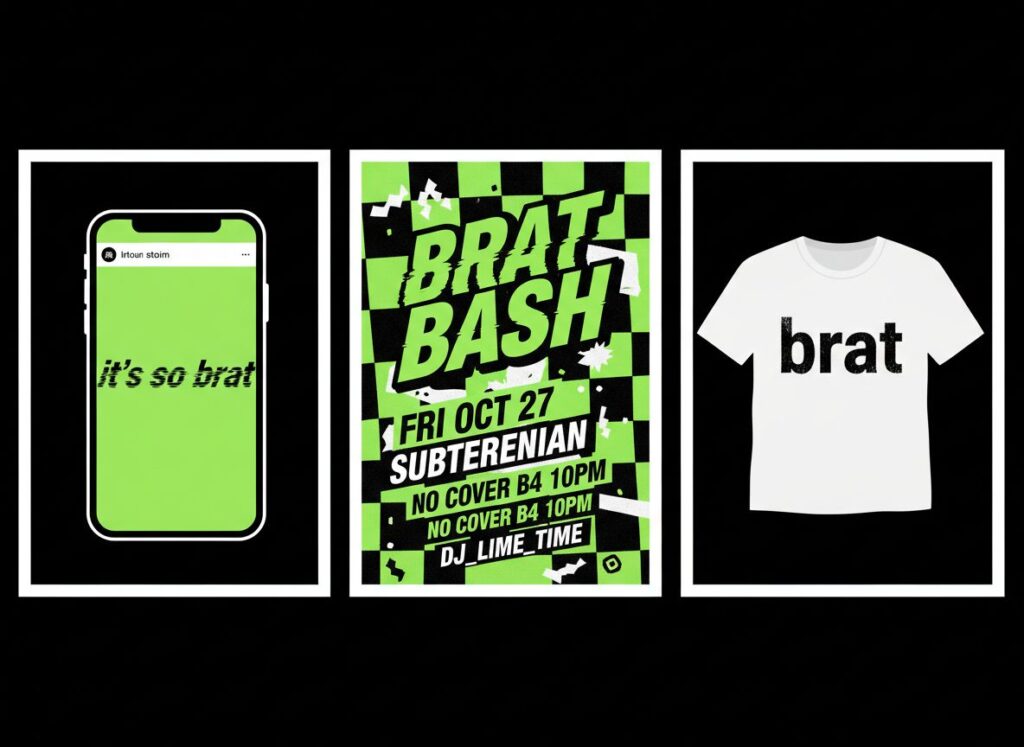
Meme Creation for X and Instagram
In the fast-paced world of X (Twitter) and IG, speed is everything. When a cultural moment happens, you don’t have an hour to design. You need a brat text font that says what you need to say now. Using a brat aesthetic font for your memes gives them an instant "certified cool" status that gets shared faster than traditional typography ever could.
Event Posters & Anti-Polished Flyers
Underground clubs and pop-up art shows in 2026 have abandoned the clean Swiss style for the brat text font. Why? Because a clean poster looks like a corporate event. A brat aesthetic font poster looks like a party you actually want to go to. It signals an "anti-polished" vibe that promises an authentic experience. Learning how to make brat style font flyers is now a survival skill for indie promoters.
Merch, DIY Tees & Tattoo References
The brat text font isn't just digital. We see it on high-fashion runways and DIY streetwear. Because Refont provides high-quality exports, you can take your brat aesthetic font design and put it directly onto a T-shirt. It’s also become a huge trend for minimalist text tattoos—the intentional "badness" of the brat text font makes for an incredibly stylish, modern piece of body art.
How Brat Font Generator Is Reshaping Visual Marketing
The rise of the brat text font represents a shift in power. You no longer need a massive agency budget to have a massive visual impact.
Micro-Niche Branding: Small Teams, Big Visual Impact
In 2026, "Micro-Niche Branding" is king. Small, two-person teams are out-competing giants by being more culturally agile. Using a brat text font generator allows these small brands to produce professional-grade, trend-aware visuals in seconds. It’s not about how much you spend; it’s about how well you understand the brat aesthetic font. Refont levels the playing field, making precision aesthetics accessible to everyone.
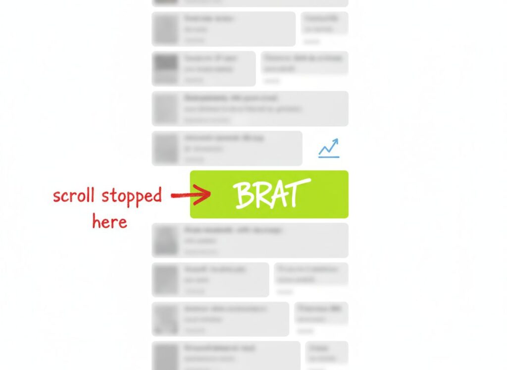
Scroll-Stoppers: Linking Design Choices to Growth Metrics
Marketing isn't just art; it’s math. The brat text font is a proven "scroll-stopper." Its visual tension (from the stretching) and curiosity-inducing texture (from the blur) lead to higher engagement rates. When you choose a brat aesthetic font, you aren't just making a stylistic choice; you are making a data-driven decision to increase your "Scroll-Stop Rate." In the attention economy of 2026, the brat text font is one of the most effective tools in your arsenal.
Frequently Asked Questions About Brat Text Font
1. What is the brat text font?
The brat text font is a lo-fi, anti-perfectionist typography style popularized by Charli XCX's Brat era. It features vertically stretched, lowercase, sans-serif text, often on a lime green background with a blurry, low-res texture.
2. How to make brat style font for my brand?
The easiest way is to use Refont’s brat text font generator. Simply input your text, select a style from the gallery, and let the AI handle the distortion and coloring to ensure your brat aesthetic font looks authentic.
3. What is the official color code for the brat text font background?
The most common "Brat Green" hex code is #8ACE00. It is a specific shade of lime green that pairs perfectly with the black brat text font.
Start Generating Your Brat Text Font Today
In 2026, the bravest thing you can do in design is be imperfect. The brat text font is more than a trend; it’s a toolkit for the bold, the messy, and the real. Whether you’re looking for how to make brat style font for your next viral post or building an entire brand around the brat aesthetic font, Refont is here to make it happen in seconds. Don’t settle for "clean" when you can have "brat." Your first masterpiece is just a click away.