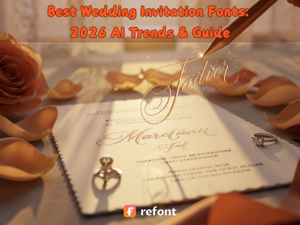
Best Wedding Invitation Fonts: 2026 AI Trends & Guide
Contents
- The Future of Wedding Invitation Fonts: From Static Templates to AI Expression
- 2026 Industry Shift: Why AI is Replacing Traditional Wedding Invitation Fonts Libraries
- Top 4 Trends Defining Modern Wedding Invitation Fonts in the AI Era
- How to Choose the Perfect Wedding Invitation Fonts & Color Schemes
- 9 Curated Wedding Invitation Fonts & Their Practical Applications
- Revolutionize Your Workflow with Refont’s Wedding Invitation Fonts Generator
- Frequently Asked Questions About Wedding Invitation Fonts
- Conclusion: Lead the Trend with Your Unique Visual Story
The Future of Wedding Invitation Fonts: From Static Templates to AI Expression
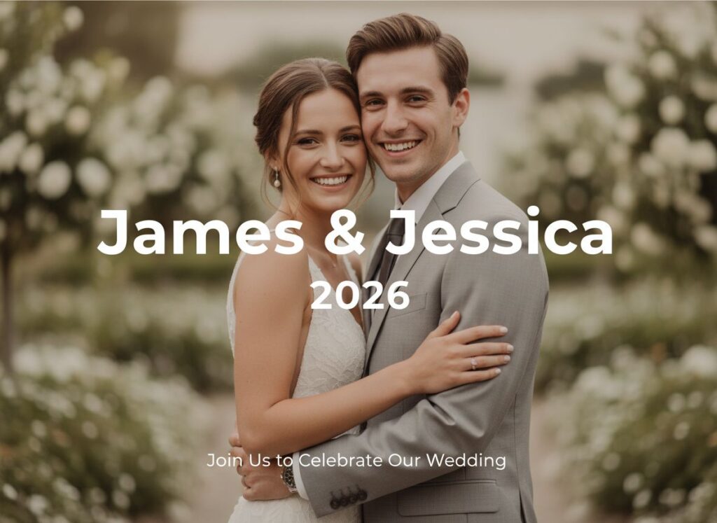
Let’s be honest: your wedding invitation is the "movie trailer" for your big day. Traditionally, wedding invitation fonts were limited to whatever was pre-installed on a designer’s PC or buried in a free font site. But in 2026, we’re witnessing a "Great Typographic Awakening."
Typography is now the visual voice of your relationship. Couples are ditching corporate-looking system fonts, realizing that unique wedding invitation fonts can set the mood better than a boring memo. It’s no longer about picking a style; it’s about creating a soul.
With AI tools like Refont, you aren't stuck with "one-size-fits-all" cursive. You can now design custom wedding invitation fonts that capture the exact pressure of a pen on paper and the unique DNA of your love story. It’s personal, it’s tech-savvy, and it’s finally as original as you are.
2026 Industry Shift: Why AI is Replacing Traditional Wedding Invitation Fonts Libraries
If you’ve spent three hours scrolling through DAFONT only to realize every "handwritten" style looks suspiciously like the one your neighbor used for her bake sale, you’ve hit the wall of the "Static Library."
The Death of the "Generic Script"
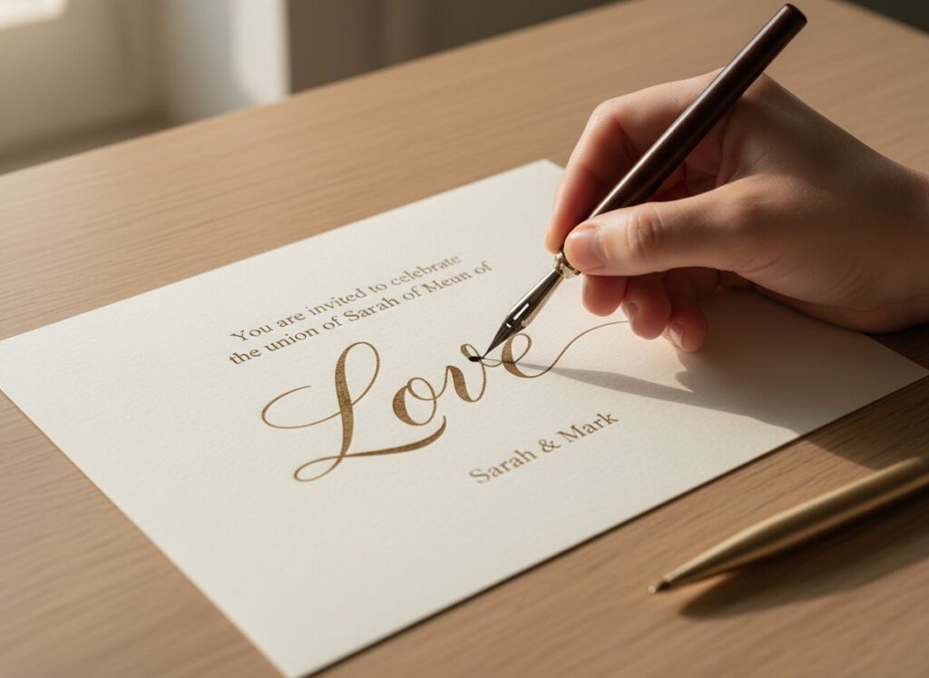
Traditional libraries are feeling a bit "cold" lately. Why? Because they’re just fixed vectors that don't care what you’re typing. In 2026, it’s all about movement. Refont’s engine has essentially killed off the generic script; instead of a dead file, you get a living style. When hunting for wedding invitation fonts, you want characters that actually flirt with each other—where the 'L' in "Love" swashes perfectly into the 'v' because the AI gets the context. It’s digital ink with a pulse.
The "Atmospheric Typography" Movement
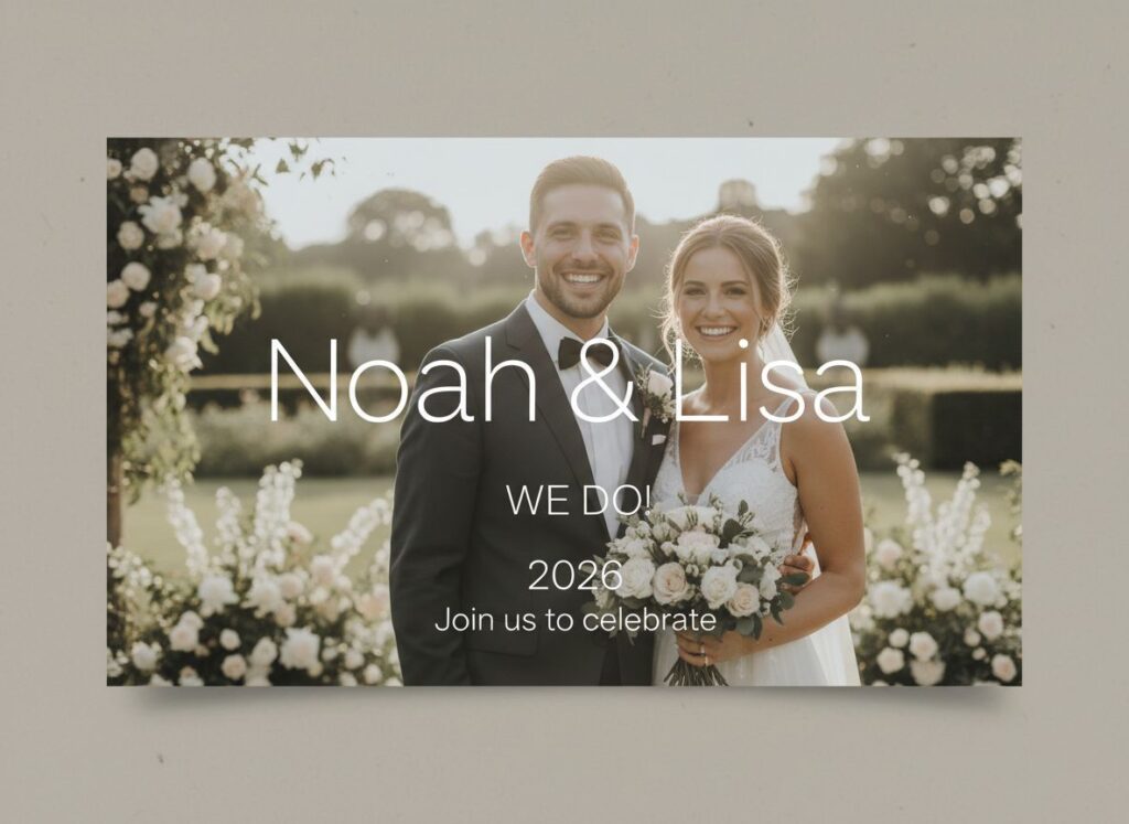
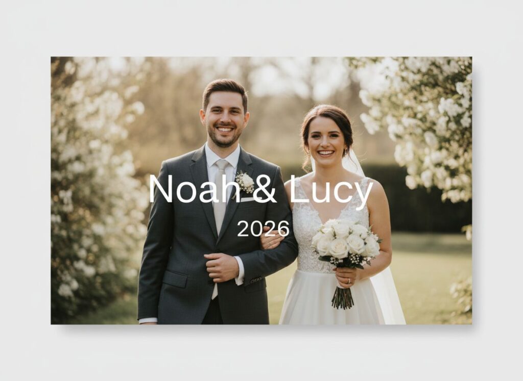
Gone are the days of the "Red & Gold" rulebook. Today’s couples are all about the vibe. Whether it’s "Midnight in Paris" or "Desert Disco," you need wedding invitation fonts that can actually keep up with your niche narrative. Standard libraries can’t pivot that fast, but AI can generate a look based on a prompt like "Ethereal, slightly messy, Italian seaside calligraphy."
This shift means you aren't just picking wedding invitation fonts from a dusty list; you’re crafting a level of personalization that makes guests feel like the envelope was hand-inked just for them. It’s high-tech, high-touch, and honestly, way more fun.
Top 4 Trends Defining Modern Wedding Invitation Fonts in the AI Era
Let’s be real: we’ve all reached "peak minimalism." If I see one more invitation in plain Helvetica, I might actually yawn. In 2026, choosing a wedding invitation font is less about "finding a pretty letter" and more about creating a vibe that guests can actually feel. Here’s what’s actually trending in the world of stationery design right now.
Trend 1: Hyper-Personalized Digital "Handwriting"
We’re currently seeing a massive shift toward AI-generated cursive. This isn't the stiff, robotic script from elementary school; it’s a sophisticated evolution of wedding invitation fonts that understands "physics." It mimics how ink flows and how pen pressure changes when your hand gets tired. This makes your DIY pairing look expensive and bespoke, rather than something slapped together in five minutes. The goal? To make guests ask, "Did they hand-ink all 200 envelopes?" (Spoiler: No, you just have a killer wedding invitation fonts).
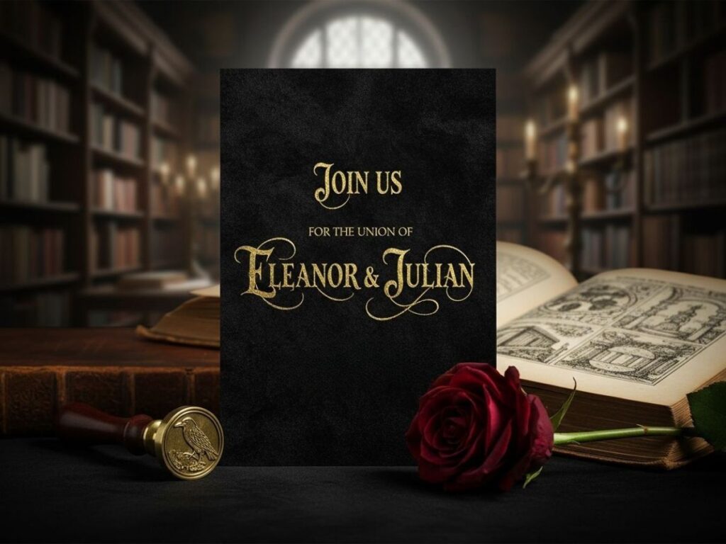
Trend 2: The Neo-Gothic & Maximalist Revival
Move over, "Sad Beige" weddings. 2026 is the year we embrace the bold and the dramatic. Neo-Gothic styles—with their sharp edges and romantic curves—are the "it" wedding invitation fonts choice for the Dark Academia crowd. Previously, Gothic was a nightmare because nobody could actually read it. But thanks to AI, we now have "legible-maximalist" versions. It’s the perfect wedding ceremony font for couples who want their stationery to look like a high-fashion editorial.
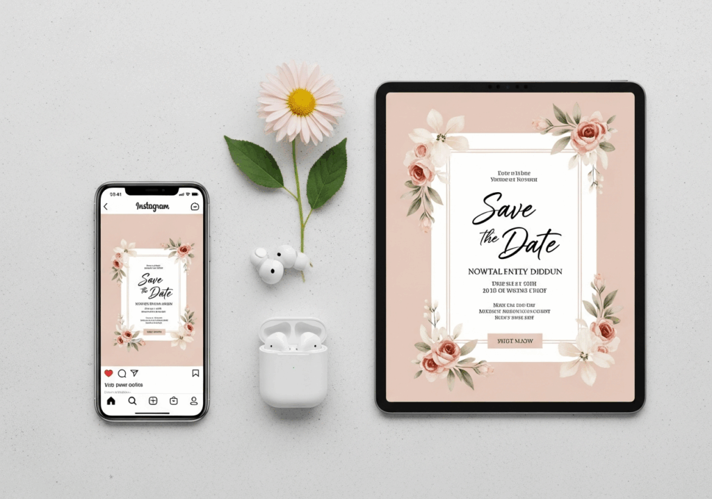
Trend 3: Screen-Optimized Elegance for Digital Invites
Since most of your friends will see your invite on Instagram or Pinterest before they ever touch the paper, your wedding invitation fonts needs to be pixel-perfect. We’re moving toward high-impact styles that don't lose their "soul" when they’re shrunk down to a 6-inch screen. These AI-refined wedding invitation fonts option have slightly reinforced lines, so the delicate details don't just vanish into the background glow of a smartphone. It keeps your wedding invitation fonts looking sharp, whether it's printed or pinned.
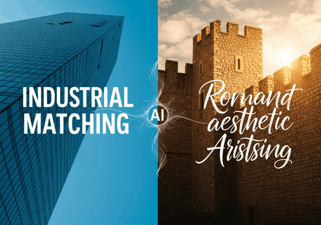
Trend 4: Semantic Aesthetic Matching
This is where it gets really cool. You’re no longer just scrolling through endless lists of names. You can now use AI to find a wedding invitation fonts that match your specific "Boho-Chic" or "Industrial Loft" theme. You aren't just picking a "pretty" style; you’re using algorithmic magic to ensure your DIY wedding invitation font pairing matches the literal texture of your venue. Whether you need a wedding invitation fonts that feel like old castle stone or one that reflects a sleek glass skyscraper, AI finds the perfect match.
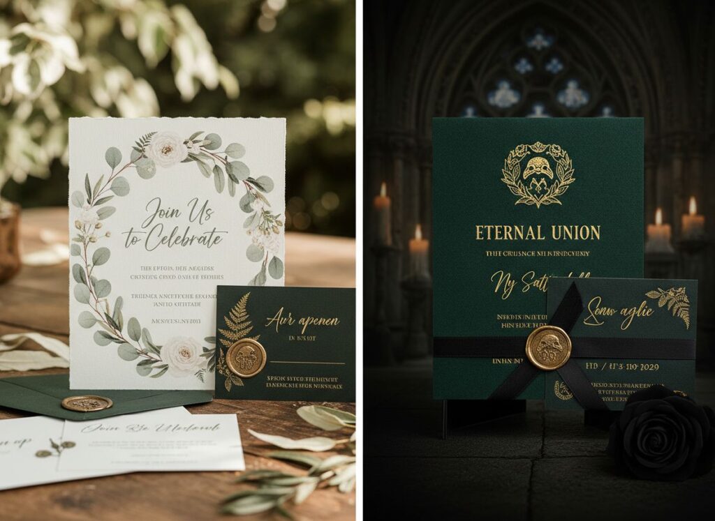
How to Choose the Perfect Wedding Invitation Fonts & Color Schemes
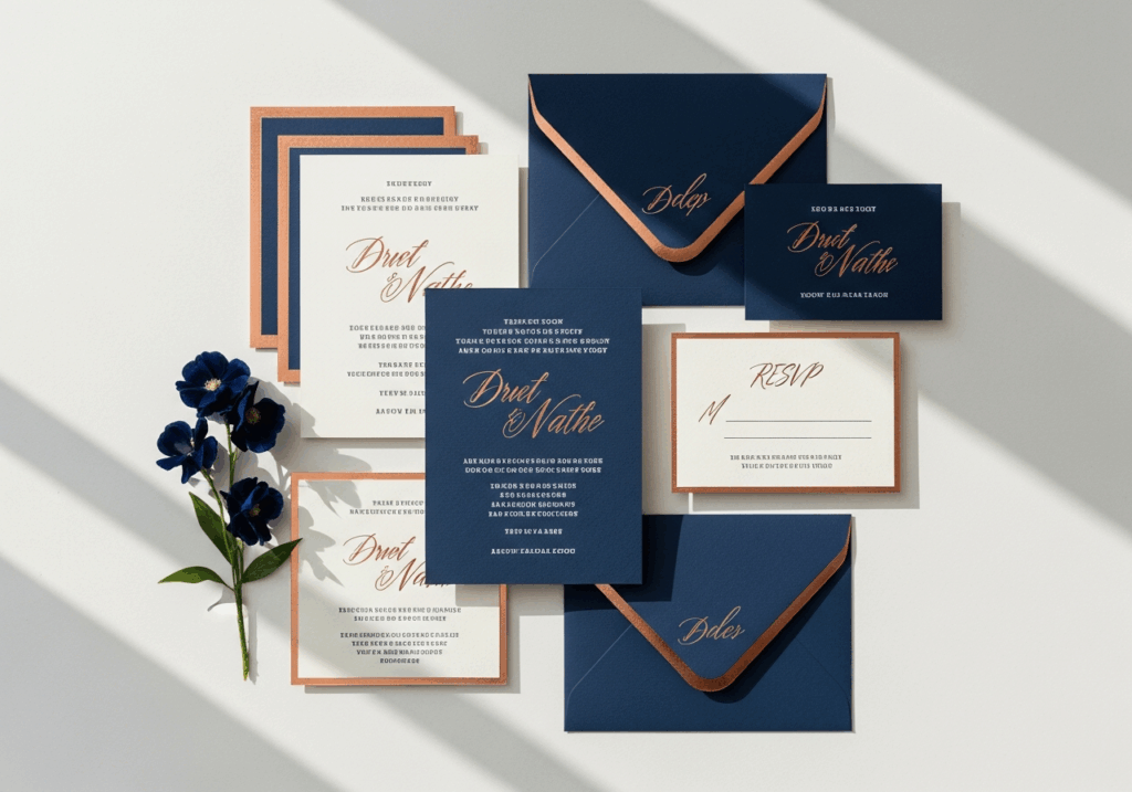
Typography and color are the undisputed "visual soul" of your big day. They act as a silent hype-man, working in tandem to set the emotional tone long before a guest even squint-reads the venue address. Think of it this way: if your wedding invitation fonts are screaming "Wild Saturday Night Party!" but your color palette is a somber, muted gray that whispers "Funeral Service," you’ve got a serious visual identity crisis on your hands. Consistency is the secret sauce to making sure your guests know exactly what kind of celebration to expect—and what to wear!
Step 1: The Psychology of Selection—Matching Your "Vibe"
Every typeface speaks a specific emotional language. When you’re navigating the (sometimes overwhelming) world of DIY wedding invitation font pairing, you need to think about the subconscious vibe you’re sending to your inner circle. It’s not just about picking wedding invitation fonts that look "cool" on a Pinterest board; it’s about what feels authentic to your personal story.
- Serifs: These fonts, with those elegant little "feet" at the ends of strokes, convey a sense of tradition and reliability. They are the go-to wedding invitation fonts for a classic, "I-do-in-a-cathedral" kind of wedding.
- Scripts/Cursive: Flowing, artistic, and a little bit fancy. This style of wedding invitation fonts evoke immediate feelings of romance and that "hand-touched" personal intimacy.
- Sans-Serifs: Clean, geometric, and modern. These represent the "Quiet Luxury" aesthetic that is absolutely dominating 2026. These are the perfect wedding invitation fonts for a chic, minimalist loft celebration.
Beyond the basic style, you’ve got to consider Venue-Centric Typography. Basically, your location should dictate your design DNA. A grand, historic ballroom practically demands the authority of a heavy serif or a structured wedding ceremony font that won't get lost under gold-leafed ceilings. On the flip side, an outdoor botanical garden wedding is begging for an airy, whimsical script—wedding invitation fonts that look like it naturally sprouted from a flowering vine.
Step 2: The Art of Color Coordination & Contrast
Once you’ve finally swiped right on your perfect wedding invitation fonts, it’s time to dress those letters in the right colors. A pro tip to keep your design from looking like a chaotic crayon box is the 60-30-10 Rule:
- 60% (Primary): This is your base layer—usually the color of the cardstock or the digital background.
- 30% (Secondary): This is where your main body text lives. Think of the dates, times, and "no-kids-allowed" disclaimers.
- 10% (Accent): Save this for the "rockstars" of the page—the names of the happy couple or the boldest wedding invitation fonts headlines.
But here’s the reality check: never let your aesthetic obsession ruin the actual point of the invite. It’s the eternal struggle of Legibility vs. Aesthetic. We all love the look of delicate gold foil on cream paper, but you need enough visual contrast so people can actually read the words. If you’re leaning into a moody, dark theme like Deep Emerald, you absolutely must use a high-contrast metallic or crisp white for your wedding ceremony font. Why? Because you want to make sure your great-aunt can actually find the church address without needing a magnifying glass and a search party. Keep that wedding invitation fonts beautiful, but for heaven's sake, keep it readable!
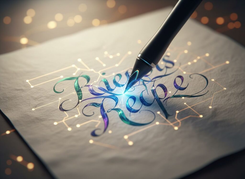
9 Curated Wedding Invitation Fonts & Their Practical Applications
Choosing the right typeface can feel like trying to find a needle in a haystack—except the haystack is made of thousands of nearly identical cursive styles. To save you from "font fatigue" and make your DIY wedding invitation font pairing a breeze, we’ve hand-picked nine elite options. These aren't just characters; they are visual soulmates for your big day, categorized by the unique energy they bring to the table.
Category 1: Best Script Wedding Invitation Fonts
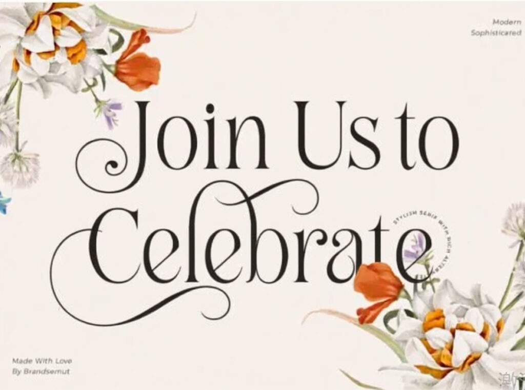
1. Lovely Font: The Whimsical Romanticist
- Vibe: Elegant, airy, and magical with whimsical flourishes that dance across the page.
- Best Use: The ultimate choice for your main wedding invitation fonts. Its sophisticated curves add a "magical touch" to fairytale or ballroom weddings, making every guest feel like they’ve just received an invite to a royal gala.
2. Rustic Wedding Font: The Countryside Charmer
- Vibe: Modern calligraphy with a vintage, organic feel that whispers of lavender fields and open skies.
- Best Use: Perfect for outdoor, barn, or vineyard weddings. It resonates with nature and looks stunning when printed on textured, recycled paper for that earthy, authentic look.
3. Romantically Font: The Bespoke Signature
- Vibe: Classy, natural, and highly personalized, as if you penned each letter yourself.
- Best Use: Ideal for the couple’s names and thank-you notes. It creates a unique "signature" look for your wedding ceremony font, making the stationery feel like a private, handwritten letter.
Category 2: Best Sans Serif Wedding Invitation Fonts
4. Mograph Font: The Minimalist Muse
- Vibe: Clean, contemporary, and strictly minimal—the visual equivalent of a crisp white shirt.
- Best Use: Essential for logistical details and info cards. It’s the reigning king of wedding invitation fonts for "Quiet Luxury" themes where you want the design to speak softly but carry a lot of weight.
5. Mayfair Font: The Great Gatsby Tribute
- Vibe: Pure 1920s Art Deco glam, blending geometric forms with classic, high-fashion strokes.
- Best Use: Best for vintage-themed weddings or Black-Tie galas. Use it for headers to instantly evoke the roaring twenties' glamour and champagne-filled nights.
6. Olive Font: The Digital-First Elite
- Vibe: Sleek, thin, and surgically optimized for maximum screen clarity.
- Best Use: The go-to wedding ceremony font for digital invites on Instagram or Pinterest. Its thin letterforms remain sharp and perfectly readable even on the smallest mobile devices.
Category 3: Best Serif Wedding Invitation Fonts
7. Belinda Avenue: The Contemporary Luxury
- Vibe: High-contrast, slim, and refined—it’s the typeface version of a Vogue cover.
- Best Use: Perfect for high-fashion or editorial-style invites. It blends classic sophistication with a chic, modern edge that feels incredibly "now."
8. Montage Font: The Lavish Estate Style
- Vibe: Thin-lettered, authentic, and unapologetically upscale.
- Best Use: Ideal for upscale estate weddings and formal menu cards. It infuses a "luxurious spark" into even the smallest printed details, ensuring everything looks impeccably expensive.
9. Alchemist Font: The Narrative Storyteller
- Vibe: Story-like, personal, and intimate—it feels like the beginning of a long-awaited adventure.
- Best Use: Best for Save-the-Dates and personal vows. Its handwritten-serif hybrid style makes it a versatile wedding ceremony font that feels like a shared visual diary of your journey together.
Revolutionize Your Workflow with Refont’s Wedding Invitation Fonts Generator
Let’s talk about the "DIY struggle." Usually, DIY wedding invitation font pairing involves downloading 50 fonts, crashing your computer, and crying over a glass of wine because nothing looks right. Refont changes that.
The Paradigm Shift: From "Manual Tweaking" to "Prompt-to-Type"
Refont’s generator is a game-changer for independent designers and DIYers. Instead of hunting for the right wedding invitation fonts, you describe them. Type in "Elegant cursive with heart-shaped connectors" and watch the AI weave magic. It saves hours of manual kerning and searching, giving you back time to worry about more important things—like the seating chart drama.
Step-by-Step Guide to Creating Your Visual Identity
- Explore Styles: Browse the massive variety in the generator.
- AI Power: Found a style you like? Click “Generate Similar” to see variations of wedding invitation fonts that fit your specific aesthetic.
- Advanced Customization: Refine the prompt to adjust textures—maybe you want the ink to look "faded" or "metallic." Download and you're ready to print!
From Digital Screen to Physical Venu
Don't stop at the paper. Use your custom wedding ceremony font for ceremony boards, welcome signs, and even custom-embossed napkins. Consistency is what separates a "nice wedding" from a "branded experience."
Frequently Asked Questions About Wedding Invitation Fonts
Q: Can I use AI-generated fonts for commercial wedding design?
Absolutely! Most Refont outputs are ready for professional use. It’s a secret weapon for wedding planners looking for unique wedding invitation fonts.
Q: How many fonts should I use on one invitation?
The "Rule of Two" is your friend. Use one decorative script as your primary wedding invitation fonts and one clean serif for the details.
Q: What is the best font for a digital Instagram invite?
Go for something bold and clear like Olive Font. It’s a high-performance wedding ceremony font that remains sharp even on mobile screens.
Q: Are Gothic fonts too aggressive for a wedding?
Not in 2026! When paired with soft pastels, a Gothic wedding ceremony font adds a sophisticated edge that feels very "Vogue."
Conclusion: Lead the Trend with Your Unique Visual Story
Your wedding is the ultimate expression of your personality. Why settle for "Default Arial" when you can have a font that reflects your soul? Typography is more than just letters on a page; it’s an invitation into your world. By mastering DIY wedding invitation font pairing and choosing the right wedding ceremony font, you create a keepsake that guests will want to frame, not just pin to their fridge.
Stop settling for generic templates. Visit Refont’s Wedding Font Generator now and create a typographic masterpiece for your big day.