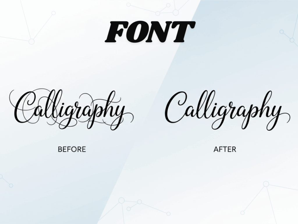
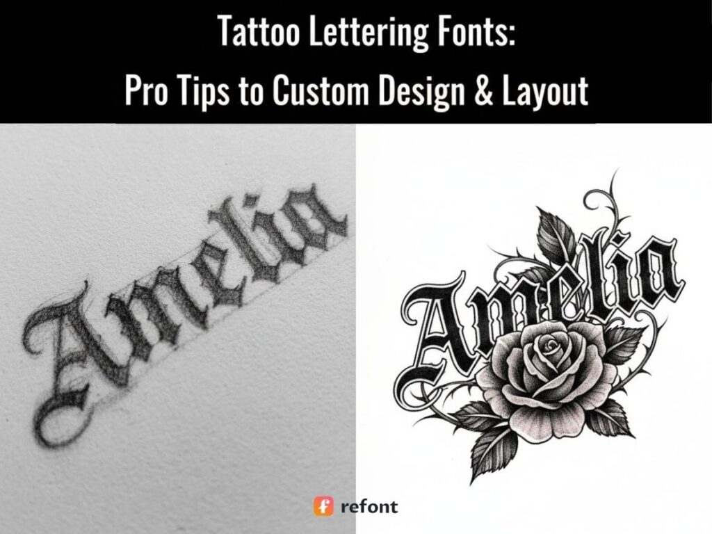
Tattoo Lettering Fonts: Pro Tips to Custom Design & Layout
Contents
- Introduction — The Communication Gap in Tattoo Design & Digital Trends
- Why Refont? Beyond Fonts to Professional Tattoo Assets
- Practical Scenarios — Finding the Right Fit
- Pro Tips — How to Choose & Avoid Pitfalls
- Frequently Asked Questions
- Conclusion
Introduction — The Communication Gap in Tattoo Design & Digital Trends
We’ve all been there. You’re sitting in the tattoo parlor, staring at your artist, trying to explain that you want a word that looks "aggressive but somehow elegant," or "messy but in a purposeful, artistic way." You have the "Love" or "Family" concept in your head, but your telepathic powers are failing you. This is the classic communication gap. In the age of digital precision, relying on "brain-fog descriptions" is the fastest way to end up with permanent ink-regret.
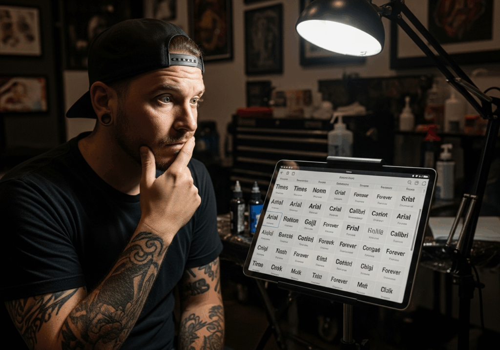
Historically, choosing tattoo lettering fonts was a gamble. You’d flip through a dusty binder of printed alphabets or hope your artist’s freehand was on point that day. For the user, the fear is real: will this computer-generated script actually look good on a living, breathing arm? For the artist, the struggle is equally painful. They spend hours on an iPad cycling through dozens of custom tattoo lettering fonts, trying to guess what "edgy" means to you. This "trial and error" loop wastes time, drains money, and turns a creative spark into a stressful chore. That’s where the bridge between digital inspiration and physical skin needs to be built.
Why Refont? Beyond Fonts to Professional Tattoo Assets
Elevate Your Ink with AI-Powered Tattoo Lettering Fonts
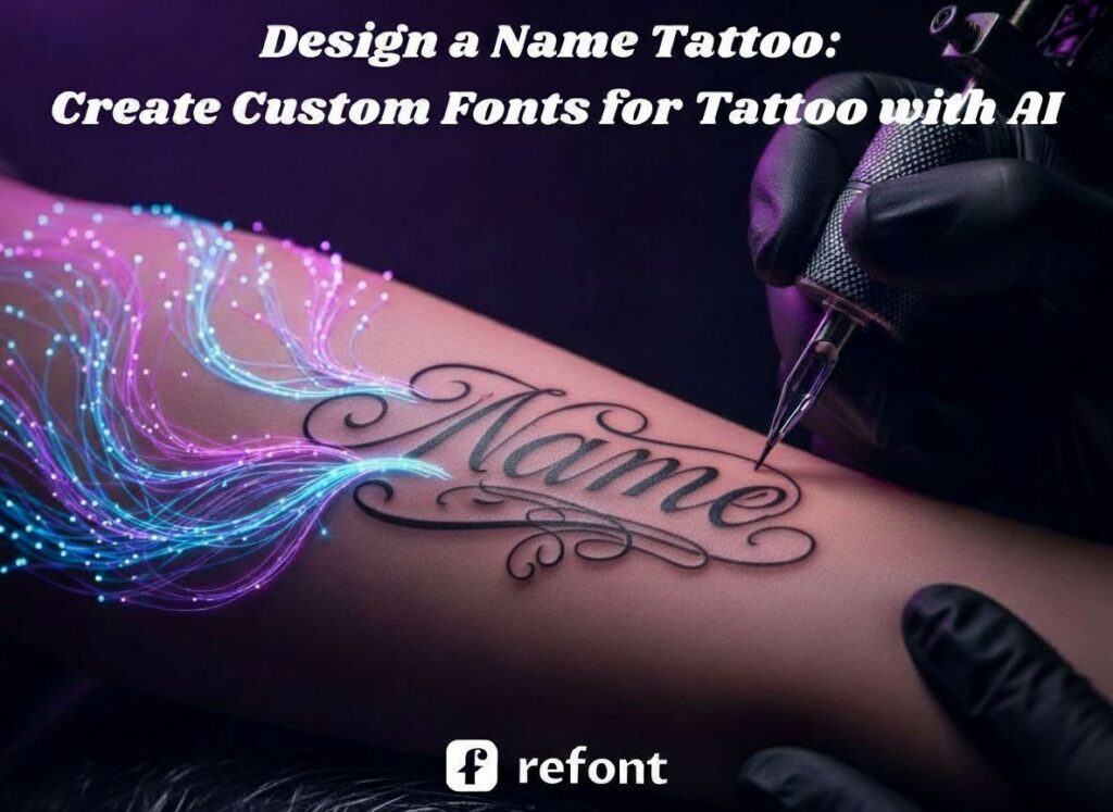
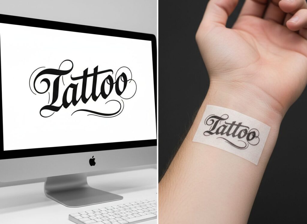
Refont isn't just another font website; it’s a specialized engine designed for the skin. When you start searching for custom tattoo lettering fonts, most platforms give you generic wedding scripts or corporate sans-serifs that look terrible as a tattoo. Refont filters the noise, focusing on "Tattoo DNA." Whether it’s the sharp, architectural lines of Gothic or the fluid, rhythmic strokes of Cursive, our curated presets ensure your tattoo lettering fonts actually belong in a studio, not a boardroom.
One of the biggest technical hurdles in tattooing is the "Stencil-Ready" requirement. Most AI tools generate blurry images with background noise, but Refont delivers high-contrast, zero-noise black and white exports. This means your artist can skip the Photoshop cleanup and go straight to the transfer paper. Furthermore, we respect the "Tattoo Physics." Our AI-driven density control prevents the dreaded ink bleed. By managing the weight of your custom tattoo lettering fonts, we ensure the lines won't disappear or blur into a dark blob five years down the line.
But the real game-changer? The tattoo text and image fusion. This isn't just slapping a word next to a picture. We offer:
- Entwined: Your tattoo lettering fonts weaving through snakes or vines for a 3D organic feel.
- Integrated: Morphing text into shapes—imagine a dagger where the blade is made of custom tattoo lettering fonts.
- Accompanied: The perfect tattoo text and image fusion layout that balances visual weight automatically.

Practical Scenarios — Finding the Right Fit
Finding the Perfect Tattoo Lettering Fonts for Every Scenario
Who exactly is scrolling through tattoo lettering fonts at 2 AM? Usually, it falls into three camps, each with a unique struggle that generic search engines just can’t solve. Whether you are getting your first tiny piece or managing a high-traffic shop, the way you approach custom tattoo lettering fonts defines the final result.
For the Novice: Visualizing the "Invisible"
If you’re a design beginner, the anxiety of "visualizing the invisible" is real. You have a deeply personal name or a life-changing quote in mind, but you don't want to "guess" how it looks in a specific script. You need to see it. By using Refont to explore custom tattoo lettering fonts, you turn a vague inspiration into a high-definition reality before you even step into a shop. This eliminates the "I hope this looks okay" prayer and replaces it with a concrete blueprint. When you can see the tattoo text and image fusion on your screen, you walk into your appointment with clarity and confidence.
For the Studio: The "Decision Accelerator"
In a professional studio, time is the most valuable currency. Instead of wasting a two-hour consultation cycling through standard system fonts, artists can use our tattoo text and image fusion tools as a "Decision Accelerator." You can present 10 professional variations of tattoo lettering fonts in under 60 seconds. This not only impresses the client with your efficiency but also significantly shortens the consultation cycle. By quickly locking in the custom tattoo lettering fonts, you get the stencil ready faster and get the needle moving, maximizing your daily output without sacrificing the artistic quality your clients expect.
For the Trendsetter: Beyond the Catalog
Finally, for the trendsetters and inspiration seekers, it’s all about exclusivity. You aren't interested in the basic scripts that dominated social media a decade ago. You are looking for unique tattoo lettering fonts that push the boundaries of modern AI art. By leveraging our tattoo text and image fusion capabilities, you can build a personalized aesthetic library of designs that are virtually impossible to replicate. This ensures your custom tattoo lettering fonts remain original, letting you stay one step ahead of mainstream trends and ensuring your ink is as unique as your own DNA.
Pro Tips — How to Choose & Avoid Pitfalls
The Decision-Maker’s Guide: From Vague Idea to Perfect Layout
Choosing your tattoo lettering fonts is about 30% style and 70% strategy. Many people make the mistake of picking a font simply because it looks cool on a white digital background. However, your body is not a flat piece of paper; it’s a living, moving, 3D canvas. If you ignore the natural anatomy of the human body, even the most beautiful custom tattoo lettering fonts will end up looking like a crooked sticker or a misplaced decal. To ensure your ink stands the test of time and looks intentional, let’s break down the professional logic of font selection and placement.
Step 1: Matching the Font Style to Your Message (The "Vibe" Check)
Fonts aren't just decorative flourishes; they carry significant emotional weight and psychological undertones. Choosing the wrong tattoo lettering fonts for a meaningful quote is like wearing a tuxedo to a beach party—it creates a visual dissonance that just feels off. You want the "voice" of the font to speak the same language as the words themselves.
- Strength & Heritage: The Gothic/Old English Choice: If your text is about "Honor," "Family," or "Strength," Gothic is your best ally. Its architectural symmetry, sharp corners, and vertical stress give a sense of permanence and historical authority. These tattoo lettering fonts are the "heavy metal" of the industry—unapologetic, bold, and commanding. They work perfectly for chest pieces or large back tattoos where you want to project power and legacy.
- Emotion & Elegance: The Fine-Line Script: For names of loved ones, the word "Love," or deeply personal mantras, Script fonts are the gold standard. These custom tattoo lettering fonts mimic the human touch and intimacy of a handwritten letter. They flow like silk across the skin, making them perfect for expressing vulnerability, grace, or a poetic connection. They are best suited for areas like the inner wrist or the collarbone.
- Modern & Minimalist: The Sans-Serif Approach: Sometimes, less truly is more. Modern sans-serif tattoo lettering fonts are perfect for coordinates, short dates, or clinical, typewriter-style quotes where clarity is the ultimate aesthetic goal. This style is for the "zero-nonsense" enthusiast who wants their ink to look sharp, clean, and intellectually sophisticated without the distraction of ornate swirls.

Step 2: Mastering the Layout (The "Visual" Logic)
Even the most expensive, handcrafted custom tattoo lettering fonts can fail spectacularly if the layout is clunky or poorly considered. You want your tattoo to look like it organically grew out of your skin, rather than looking like a temporary tattoo slapped on haphazardly at a carnival.
- Curvature vs. Linear: Following the Body’s ContourNever place a perfectly straight, horizontal line of text on a curved or tapered body part like the ribs, shoulder, or forearm. Because the body is cylindrical, a straight line will appear "dipped" or distorted as you move. Instead, use Refont’s Accompanied Mode to create a subtle, intentional arc that flows with your natural bone structure and muscle groups. This specialized approach to tattoo text and image fusion ensures that the lettering remains readable and aesthetically pleasing from every angle.
- Visual Weight & Hierarchy: Mixing Fonts and Patterns) To avoid the dreaded "black smudge" effect where the eye doesn't know where to look, you must establish a clear visual hierarchy. If you have a large, detailed graphic, keep your tattoo lettering fonts simple and clean to avoid visual clutter. Conversely, if the font is the star of the show—such as a bold, sprawling Chicano masterpiece—you must keep the surrounding tattoo text and image fusion patterns subtle and light. Balance is the secret to a professional-grade composition.
Step 3: Using the Generator as Your "Digital Mirror"
- The "Scale" Test: One of the biggest pitfalls in digital design is the screen-to-skin translation. What looks legible on a high-resolution 27-inch monitor might look like a blurry, unrecognizable mess on a 2-inch wrist. We recommend generating your chosen custom tattoo lettering fonts in three different thicknesses (Fine, Medium, and Bold). Print them out at the actual size you intend to tattoo. This "digital mirror" technique allows you to see exactly which version remains crisp and legible when shrunken down to the physical constraints of your body.
The Golden Rules of "Skin-First" Design
Unlike static substrates like paper or digital screens, the human body is a dynamic canvas. Designing for the skin requires a mastery of 'Tattoo Physics'—the physiological reality of how dermal layers stretch, age, and how ink particles naturally migrate within the tissue over the decades.
The 20% Negative Space Rule
Let’s talk about the biological reality of "Ink Migration." Over a span of 10 to 20 years, the ink particles trapped under your skin will naturally spread and settle. If the kerning (spacing) of your custom tattoo lettering fonts is too tight, enclosed letters like "e," "a," or "o" will eventually fuse into solid black dots. To prevent your meaningful quote from becoming an illegible smear, always ensure there is at least 20% "breathing room" or negative space within and between your letters. This technical foresight ensures your tattoo lettering fonts remain readable and sharp well into your old age.
High Contrast for Longevity
In the world of tattooing, clarity is your best friend against the passage of time. While soft, grey, "lineless" shading can look beautiful on day one, it often fades into a muddy blur. Sharp black outlines are far superior when it comes to the longevity of tattoo lettering fonts. High contrast—the stark difference between dark ink and natural skin tone—ensures that even as the skin loses elasticity, the message remains crisp. When you are planning your tattoo text and image fusion, prioritize bold, definitive outlines over delicate, watery gradients to safeguard the design’s future.
Anatomical Safety
Strategic placement is just as important as the design itself. Avoid placing complex tattoo text and image fusion designs directly on high-motion "bend" zones like the inner elbows, knees, or armpits. The skin distortion in these areas is extreme; the skin stretches and folds constantly. A perfectly designed set of custom tattoo lettering fonts will look warped, stretched, and completely illegible every time you move your limb. For text-heavy designs, stick to the flatter, more stable planes of the body—such as the outer forearm, the thigh, or the upper back—to maintain the structural integrity and beauty of the font.
Frequently Asked Questions
Can I bring an AI-generated design to my artist?
Absolutely. Think of it as a high-fidelity blueprint. It shows your artist exactly what you want in terms of custom tattoo lettering fonts and layout, giving them a professional starting point to refine based on their expertise.
How do I know if a font will blur?
It's all about line density. Our tattoo lettering fonts generator includes safety thresholds. If the lines are too close or too thin, we suggest adjustments. Remember the 20% rule—if there's no room for the ink to move, the design won't age well.
Conclusion
Choosing tattoo lettering fonts shouldn't be a game of "I hope this looks okay." By using modern AI tools for tattoo text and image fusion, you can bridge the gap between a vague idea and a professional design. Whether you are looking for custom tattoo lettering fonts to honor a loved one or a complex piece of art, planning with "Tattoo Physics" in mind ensures your ink looks as good in twenty years as it does on day one. Ready to visualize your next piece? Start designing your tattoo lettering fonts with Refont today and walk into your next appointment with total confidence!