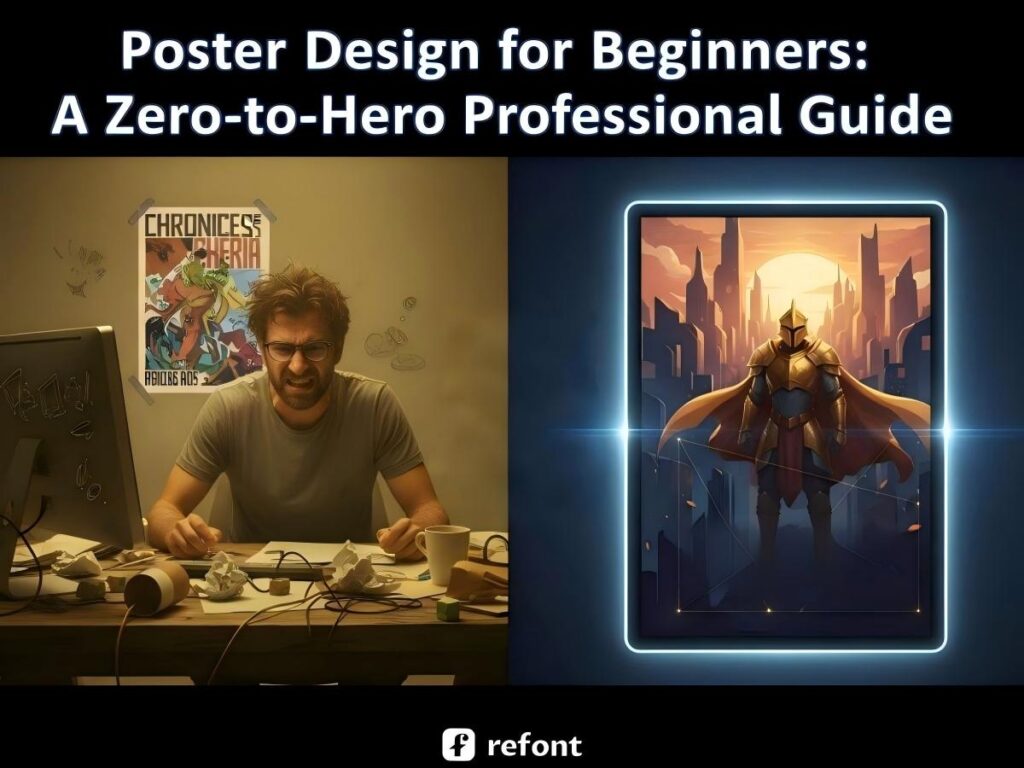
Mastering Professional Poster Design: A Zero-to-Hero Guide for Beginners
Contents
- The Science of Visual Impact: Core Poster Design Principles
- Scenario-Specific Strategies for Poster Design
- The "Amateur Trap": Why Manual Design Often Fails
- Revolutionizing the Workflow: How Refont AI Redefines Poster Design
- Step-by-Step: How to Use Refont AI Poster Generator
- Conclusion: Elevate Your Brand with AI-Driven Poster Design
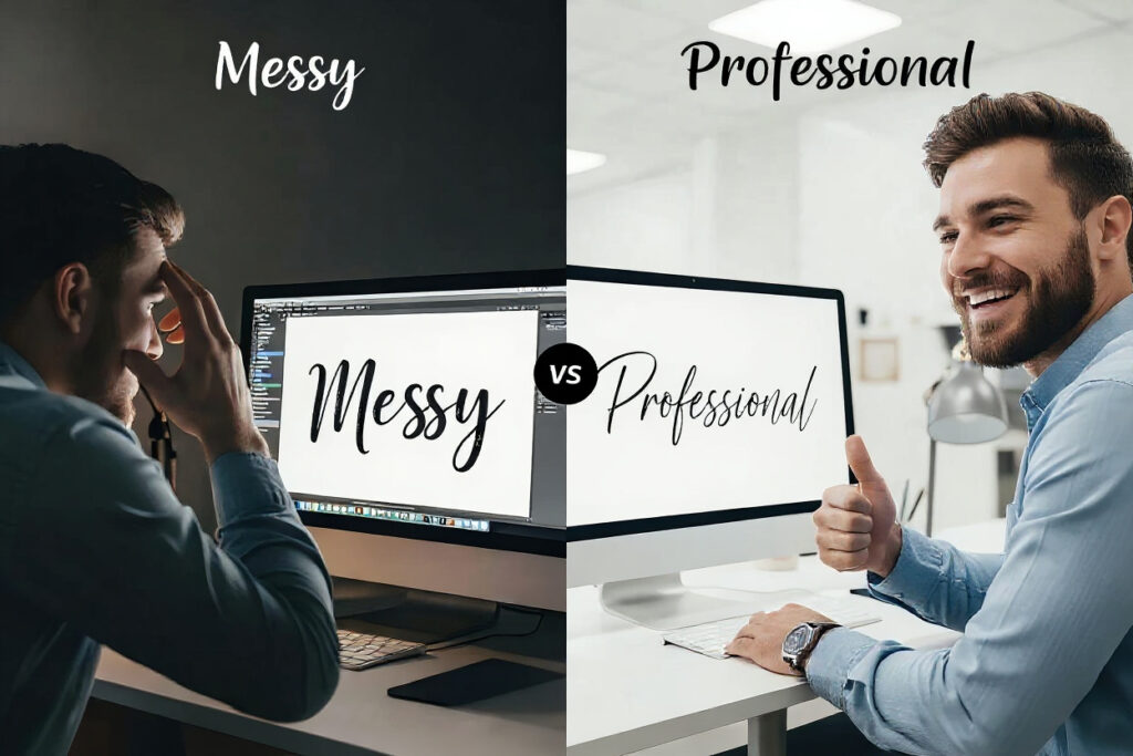
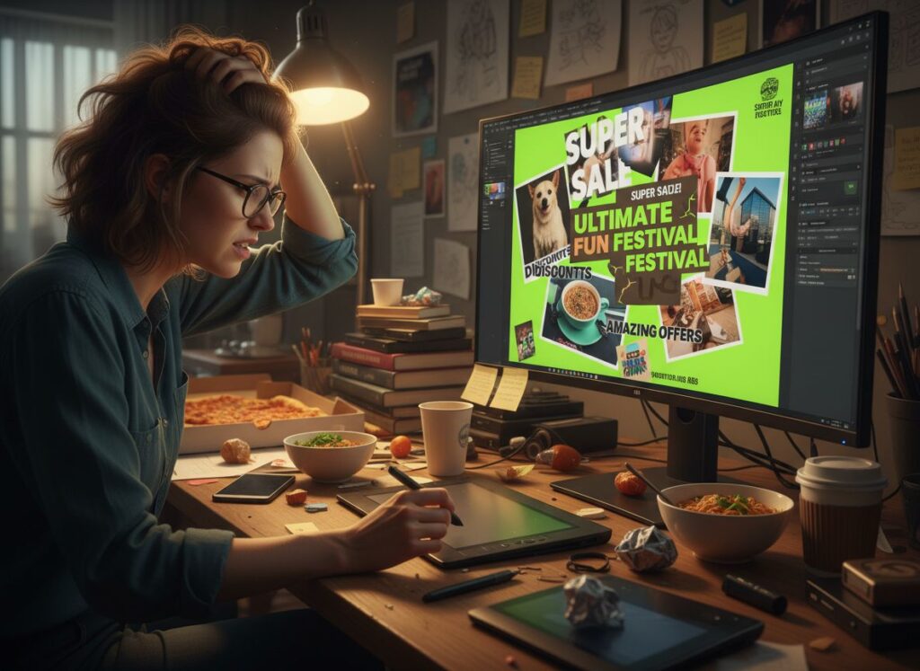
We’ve all been there. You have a brilliant idea for a sale, a workshop, or a new product launch, but then you open a blank design canvas and... crickets. Your brain goes as white as the screen. For most non-designers, the leap from "idea" to a polished poster design feels like trying to fly a Boeing 747 without a manual. You worry about fonts looking "cheap," colors clashing like bad outfits, and the overall result looking, well, amateur.
But here’s the secret: great poster design for beginners isn't about being born with an "artist’s soul." It’s about understanding the hidden logic behind why we click on some things and ignore others. Design is a science of psychology and structure. In this guide, we’ll move beyond the blank-page anxiety and show you how online poster design has evolved from a tedious chore into a strategic, AI-powered superpower.
The Science of Visual Impact: Core Poster Design Principles
To master poster design, you first need to stop "guessing" what looks good and start understanding the psychological triggers that command attention. Designing without principles is like cooking without a recipe—you might get lucky once, but you’ll mostly just end up with a mess. Let’s break down the three pillars of visual persuasion that separate the high-converting pros from the weekend hobbyists.
Strategic Color Psychology & Palette Harmony
Color is the very first thing our brains process—often before we’ve even consciously "seen" the image. It sets the temperature of the entire conversation. If your colors are screaming at each other, your audience will simply walk away.
The 60-30-10 Rule for Commercial Balance
Don't drown your audience in a chaotic rainbow. Professional online poster design relies on the 60-30-10 rule to maintain sanity: 60% of your poster should be a dominant neutral color (usually your background) to provide a canvas; 30% should be a secondary color for supporting shapes, borders, or secondary text; and the final 10% is your "spark"—the high-contrast accent color reserved strictly for your Call-to-Action (CTA) or price. This creates a visual path that feels intentional, not accidental.
High-Contrast Combinations for "Stop-and-Look" Effect
If you want people to "stop and look" amidst a sea of content, you need visual friction. Use complementary colors—those opposite each other on the color wheel. A bright yellow "Claim Now" button on a deep, royal purple background isn't just an aesthetic choice; it’s a visual command that tells the brain exactly where to land.
The Golden Rules of Layout and Hierarchy
A poster without a clear hierarchy isn't a design; it's just a grocery list of words. You must tell the viewer’s eyes where to go first, second, and last.
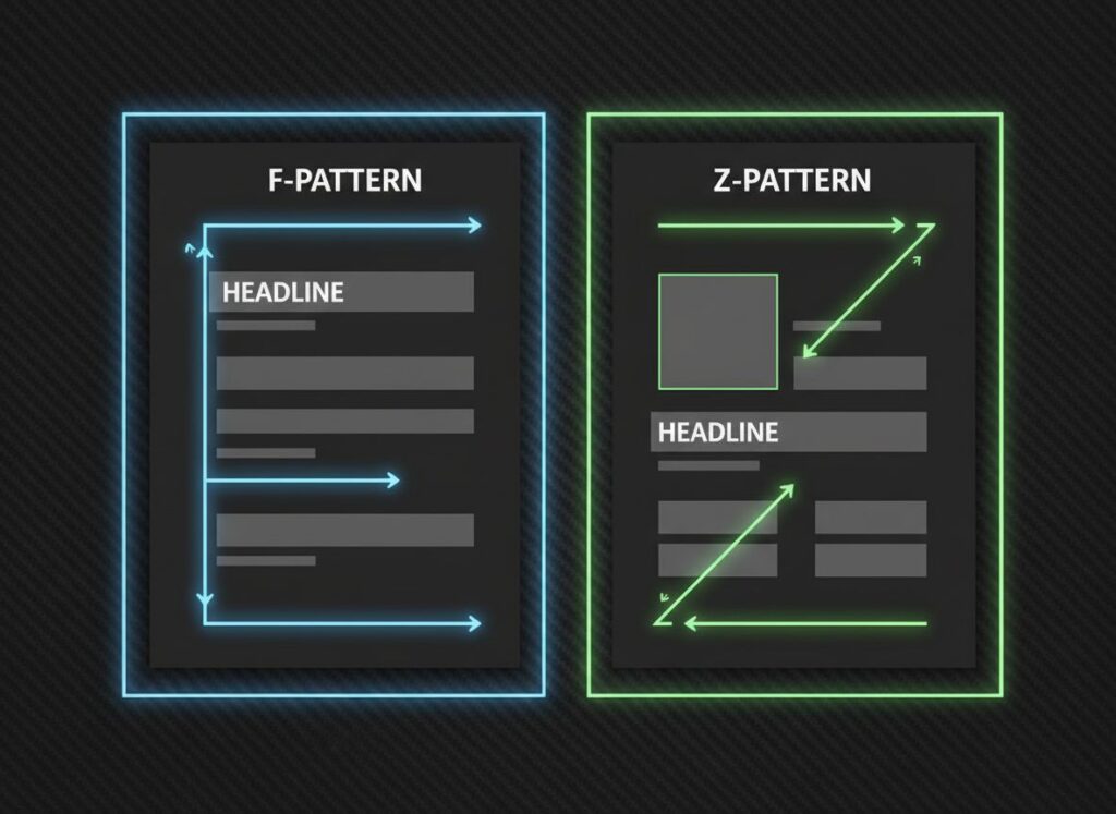
Utilizing F-Pattern and Z-Pattern for Information Flow
In Western cultures, we are biologically wired to "scan" rather than read. For information-heavy poster design for beginners, use the F-Pattern: place the most vital hook at the top-left and secondary details along the left rail. For minimalist designs, the Z-Pattern is king—lead the eye from the logo at the top-left, across to a supporting graphic, zig-zag down to the headline, and finish strong at the bottom-right with your contact info.
White Space: The Secret to "Premium" Aesthetics
Newbies fear empty space and try to fill every pixel with "value." Pros embrace it. White space (or negative space) is the silence between the musical notes. It gives your content room to breathe and signals to the audience that your brand is confident and organized. It says, "I don't need to scream to be heard."
Typography as an Identity
Typography is the "body language" of your design. It speaks long before the reader actually deciphers the words.
Matching Font Style to Brand Voice
If you’re hosting a serious law seminar, using Comic Sans is a death sentence for your credibility. Conversely, avoid using rigid Serif fonts like Times New Roman for a high-energy rock concert. Your choice—be it a bold Gothic for edge, a flowing Brush Script for personality, or a Minimalist Sans for modern tech—is the literal "voice" of your poster. Choose a voice that matches your message, or your audience will feel the "visual dissonance" immediately.
Scenario-Specific Strategies for Poster Design
Effective online poster design requires you to "read the room." A masterpiece designed for a quiet office hallway will fail miserably in the chaotic, high-speed world of a social media feed. You must adapt your visual language to the platform and the psychological state of your viewer. Context isn't just a factor; it is the foundation of your design strategy.
Social Media & Product Showcases
On platforms like Instagram, TikTok, or Pinterest, you aren't just competing with other brands; you’re competing with viral memes and life updates from friends. In this high-speed environment, you have about 0.5 seconds to stop a user’s thumb. This is where poster design for beginners often fails by trying to say too much at once.
- The Strategy: High-saturation, high-impact visuals are your best friends. Use a "Center-Focus" layout where the product or key image is the undisputed hero, flanked by minimal distractions. Your copy should be punchy and strictly under 10 words. In the world of online poster design, visual clarity is currency. If they have to squint or read a paragraph, they’ve already scrolled past you.
Business Promotions & Recruitment
When designing for business or hiring, the goal shifts from "grabbing attention" to "earning trust." You are delivering a professional promise, whether it's a 50% discount or a career opportunity.
- The Strategy: Structure is the key to authority. Use a "Grid Layout" to organize data into logical, digestible chunks. If it’s a recruitment poster, the job title and salary should be your "visual anchors"—the largest, boldest elements on the page. Stick to a stable palette like Navy Blue or Slate Gray to convey reliability. In this scenario, a clean poster design tells the viewer that your organization is just as professional and organized as the visual they are looking at.
The "Amateur Trap": Why Manual Design Often Fails
Even after reading all the blogs on poster design for beginners, many people still trip over the same three stones.
- The Watermark Nightmare: You find the "perfect" image on Google, only to realize it has a giant watermark or is too low-res to print. Now you're back to square one, wasting hours on stock photo sites.
- The "Sticker" Text Effect: You try to put text over a photo, but it looks like a cheap sticker slapped on top. It doesn't blend with the lighting or shadows, making your online poster design look disconnected and messy.
- Local Edit Frustration: You use a free template, but you want to move one specific tree or change a date without ruining the whole background. Most tools won't let you do that. It’s either "take it as it is" or "start from scratch."
Revolutionizing the Workflow: How Refont AI Redefines Poster Design
We live in an era where you shouldn’t have to suffer for your art. If you’ve ever spent hours fighting with layers in Photoshop only to end up with something that looks like a 2005 PowerPoint slide, you know the frustration. Refont’s AI Poster Generator was built to bridge the gap between creative vision and technical execution. It solves every "Amateur Trap" mentioned above, making online poster design feel like an intuitive magic trick rather than a complex math equation.
From Prompt Anxiety to One-Click Excellence
Structured Style Cards: Professional Design in a Box
Many AI tools are intimidating because they require you to be a "prompt engineer," writing 500-word descriptions just to get a decent result. Refont eliminates this barrier with Style Cards. These are essentially pre-packaged design "DNAs" that already understand lighting, composition, and mood. Whether you want "Cyberpunk Neon" or "Scandi Minimalist," you just pick the card, and the AI handles the heavy lifting of poster design, ensuring the output follows professional aesthetic laws automatically.
The Power of Refont’s Native Typography
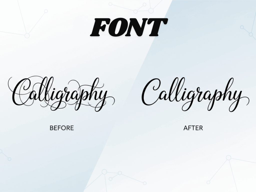
Text is notoriously the "Achilles' heel" of AI. Most generators struggle with spelling or create "Gibberish" characters that look like an alien language. Refont is a game-changer because we are font experts first and AI developers second.
Overcoming Font Glitches and "Floating" Text
Refont’s engine ensures that your Gothic, Brush Script, or elegant Cursive titles are rendered perfectly. You won't see weird AI artifacts or mangled letters. It provides a level of typographic crispness that was previously impossible in the world of online poster design.
Adaptive Lighting and Texture Integration
Our AI doesn't just "place" text on top of an image; it embeds it into the environment. If your background is a grainy vintage paper, your text will adopt that same texture. If there’s a strong light source from the left, the AI calculates the correct shadows to cast on the right. This integration is the holy grail of poster design for beginners, removing that "cheap sticker" look instantly.
Precision Control with AI Inpainting
Effortless Object Removal and Text Swapping
Found a perfect generation but hate a tiny detail? Most AI tools force you to "reroll" the whole image, losing what you liked. Refont’s Inpainting tool gives you surgical precision. Simply brush over a stray object to remove it, or highlight a text area to swap a "Summer Sale" tag for a "Winter Clearance." This flexibility is why Refont is the leading choice for professional-grade poster design.
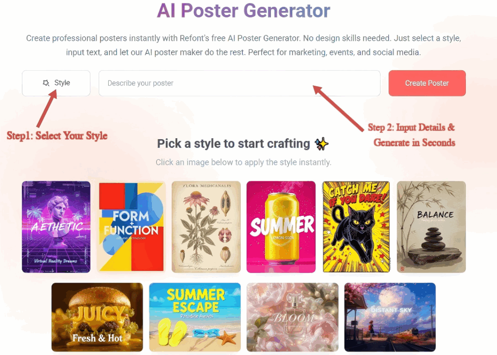
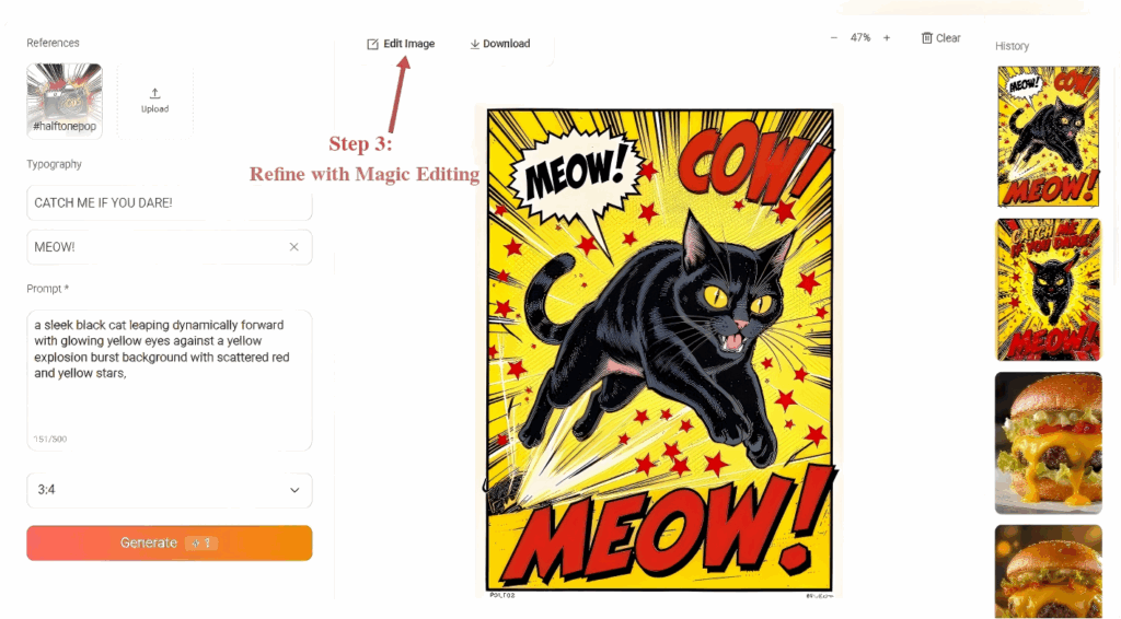
Step-by-Step: How to Use Refont AI Poster Generator
Ready to get your hands dirty? Here is the streamlined workflow for Poster Design for Beginners using Refont’s three-step system:
Select Your Style from the "Style Wall"
Browse our curated "Style Wall" to find the perfect vibe for your scenario, whether it’s a product sale or a social media update. Once selected, our AI handles the complex composition rules automatically, ensuring your Online Poster Design starts with a professional foundation.
Input Details & Generate in Seconds
Simply fill in key information—like your main headline or a product description. You can even upload your own product image. Watch as the AI intelligently combines your inputs with the chosen style to generate a complete Poster Design in just seconds.
Refine with Magic Editing
If a detail isn't quite right, use the "Edit Image" feature for precise Inpainting. Simply brush over any area you want to change—whether it’s a typo or an unwanted background element—and type a command. This ensures your Online Poster Design reaches a professional, polished finish before you Export & Shine.
Conclusion: Elevate Your Brand with AI-Driven Poster Design
In the end, AI isn't here to replace the designer’s heart; it’s here to liberate the non-designer’s hands. By mastering the basic logic of color, hierarchy, and typography, and using Refont to execute those ideas, you’ve closed the gap between "amateur" and "pro." Poster design for beginners doesn't have to look like beginner work. It should look like your work, amplified by world-class technology.